
Ok, so I have instagram, not that I've ever posted, but originally it was a way to follow tattoo artists. I recently added a photographer from Auzzy land, and all the sudden my instagram is flooded with all manner of "best of bird...." posts.....bummer, but that's freaky social media. That aside, initially I was taken back by all manner of exotic (to me, I live in California) colorful birds I've never seen before....but after a while my eyes tired of the images. It appears to me tons of photos are posted where the colors of the birds are so super saturated, and the images so overly sharpened, as to tire my eyes. I'm thinking sort of out loud if there is a line I need to be mindful of when it comes to sharpness and color saturation to go to improve, but at the same time not go so far that the image stops "feeling" natural. Not sure if anyone else has wrestled with this, but occurred to me scrolling through my instagram tonight and thought I'd throw it out there.
You are using an out of date browser. It may not display this or other websites correctly.
You should upgrade or use an alternative browser.
You should upgrade or use an alternative browser.
Is there such a thing as too sharp (over processed)
- Thread starter marklangner
- Start date
If you would like to post, you'll need to register. Note that if you have a BCG store account, you'll need a new, separate account here (we keep the two sites separate for security purposes).
It’s Aussie land actually, but that aside, there is definitely such things as over-processed and over sharpened. Unless it’s the intent, when it stops looking normal / natural you’ve gone too far. Over sharpening is very common when people try to rescue soft images. You often see odd artifacts adjacent to the outlines.
While it's of course always a matter of personal taste; I do tend to agree with you. It's easy enough to go overboard with the sharpening and saturation sliders and make the image look almost comic book like (which I personally don't really like too much either).
The birds over here are not super colourful; so it's less of an issue for me mostly")
The birds over here are not super colourful; so it's less of an issue for me mostly
Yup, over processing including over sharpening and way too much saturation is a common thing these days.
Dan291
Member
My monitor is calibrated and all my NEFs look fine. For whatever reason, my Lightroom exports, using Steve’s export routine, are garishly oversaturated. Anything I export for here I have to drop saturation -24 to -26 to match the NEF.
When I first bought Topaz Sharpen, I tried it on some old Kodachrome scans. Really worked well, but I had to rein myself in from overdoing it on all the slide files. I’ve never been one to do drastic sky replacements (other than augmenting clouds that were already there), so now I’m better behaved. I use Denoise AI, I crop, that’s pretty much it.
When I first bought Topaz Sharpen, I tried it on some old Kodachrome scans. Really worked well, but I had to rein myself in from overdoing it on all the slide files. I’ve never been one to do drastic sky replacements (other than augmenting clouds that were already there), so now I’m better behaved. I use Denoise AI, I crop, that’s pretty much it.
An oldie but goodie:
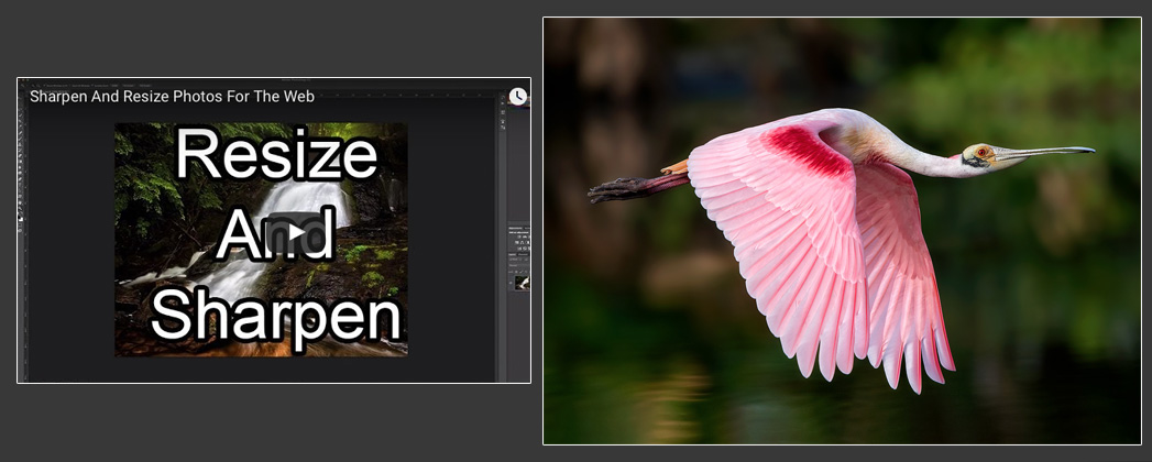
 backcountrygallery.com
Sharpen And Resize Photos For The Web - Backcountry Gallery
Wanna make your web images look their best? Then you need a good resize and sharpening method! I’ve tried quite a few and discovered there’s a lot more to it than just shrinking down an image and applying a quick bit of sharpening. You need to know the proper bit depth, color space, resize...
Ah what would we do without him?
As others have said, it's all personal taste and style. Any effect can be overdone. I'm not a big fan of the "high key" dreamy look in wedding and portrait photos but that seems to be all the rage these days.
Personally, I tend to use very little sharpening and any playing with saturation or selective color saturation is to make the photo look like my eye saw the scene in nature. My goal is realism (well as close to realism as we can get in a digital photo). I may clone out distractions like litter in the scene (why is it always beer cans and water bottles?) or distracting telephone/electric wires running across the sky. Other than that, nature is messy and if a branch is running between me and the animal, well, that is what was really there.
Back to the OP - sorry, I drifted off in another direction - yes I think it is possible and easy to over sharpen and over saturate. I see it in social media quite frequently.
My monitor is calibrated and all my NEFs look fine. For whatever reason, my Lightroom exports, using Steve’s export routine, are garishly oversaturated. Anything I export for here I have to drop saturation -24 to -26 to match the NEF.
Are you talking about unedited NEFs? Have you looked at your exported images on a different computer?
Dan291
Member
Unedited straight-out-of-Lightroom NEFs after importing. They look oversaturated on a iPad also. Only the JPEGs. TIFs look fine. I even recalibrated to be certain. Doesn’t bug me much, just a curiosity at this point.Are you talking about unedited NEFs? Have you looked at your exported images on a different computer?
Since I only shoot RAW and print direct from Lightroom, desaturating what JPEGs I deal with has just become a last step in the workflow.
Last edited:
Keep in mind that things like contrast and white / black points can also create a sharp increase in saturation. There are times that I have to reduce vibrance / saturation if I need to add a significant amount of contrast (or if my white / black points are aggressive).Unedited straight-out-of-Lightroom NEFs after importing. They look oversaturated on a iPad also. Only the JPEGs. TIFs look fine. I even recalibrated to be certain. Doesn’t bug me much, just a curiosity at this point.
Since I print, desaturating what JPEGs I deal with has just become a last step in the workflow.
Also, my Photoshop (not Lightroom) export routine requires you to manually adjust both the darkening and saturation layer. I usually knock them down to 50%.
Back to the topic, yes, I agree that too many pics are far over saturated / sharpened. The problem is, stuff like that is what gets the attention so it's a self-reinforcing cycle. The average shooter / person looks at an overly sharpened image and marvels at how sharp the lens is! Sigh...
Also, keep in mind that many devices also contribute to this. My pics always look more saturated on an iPad or phone than they do on my calibrated monitors.
Dan291
Member
I always figured that my calibration figured into it, since my main focus there was to have my printer output and screen rendition match one another. The only manual monitor adjustment I made was to drop screen brightness down as the SpyderX utility kept wanting to put it at 120… way too bright.Keep in mind that things like contrast and white / black points can also create a sharp increase in saturation. There are times that I have to reduce vibrance / saturation if I need to add a significant amount of contrast (or if my white / black points are aggressive).
Also, my Photoshop (not Lightroom) export routine requires you to manually adjust both the darkening and saturation layer. I usually knock them down to 50%.
…
Also, keep in mind that many devices also contribute to this. My pics always look more saturated on an iPad or phone than they do on my calibrated monitors.
The other thing that enters into it is the colorspace you export to. The web pretty much speaks srgb and there are times something in Adobe RGB or prophoto can look bad. Easy to convert.
One thing I like in Lightroom is being able to hold the alt key on several tools. For example the masking threshhold and the sharpening radius. Seems like a smaller radius is needed for downsampling to the web, .5 or less.
One thing I like in Lightroom is being able to hold the alt key on several tools. For example the masking threshhold and the sharpening radius. Seems like a smaller radius is needed for downsampling to the web, .5 or less.
So is the method in the video pretty much still your current method?Keep in mind that things like contrast and white / black points can also create a sharp increase in saturation. There are times that I have to reduce vibrance / saturation if I need to add a significant amount of contrast (or if my white / black points are aggressive).
Also, my Photoshop (not Lightroom) export routine requires you to manually adjust both the darkening and saturation layer. I usually knock them down to 50%.
Back to the topic, yes, I agree that too many pics are far over saturated / sharpened. The problem is, stuff like that is what gets the attention so it's a self-reinforcing cycle. The average shooter / person looks at an overly sharpened image and marvels at how sharp the lens is! Sigh...
Also, keep in mind that many devices also contribute to this. My pics always look more saturated on an iPad or phone than they do on my calibrated monitors.
Dan291
Member
The other thing that enters into it is the colorspace you export to. The web pretty much speaks srgb and there are times something in Adobe RGB or prophoto can look bad. Easy to convert.
One thing I like in Lightroom is being able to hold the alt key on several tools. For example the masking threshhold and the sharpening radius. Seems like a smaller radius is needed for downsampling to the web, .5 or less.
The change in color space is one thing I didn’t consider. Doh!
yes! sometimes I think digital has ruined photography and we would be better of going back to film
The change in color space is one thing I didn’t consider. Doh!
I was going to flag this up, but as you said you use Steve's method that includes this, I didn't.......... Lesson learnt.
Dan291
Member
Learnt, indeed. I feel smarter already.I was going to flag this up, but as you said you use Steve's method that includes this, I didn't.......... Lesson learnt.
Grandpa always said, “If you can’t laugh at yourself, it’s gonna be a long day.”
Seems sometimes my stupid questions actually illicit something of benefit to someone else (plus I learn)....good info here.
Yup, it's still what I use today.So is the method in the video pretty much still your current method?
Note that in re to colorspace, the actions I give away with that method do convert to 8 bit sRGB, so no worries about that either.
Darwin
Well-known member
I completely agree. In fact, I think too many people jump right to Topaz for every image. I really try to never use it unless it's a great shot and it's just too much noise for LR. The biggest thing I see online images is over noise reduction to the point of it being very soft. I have really focused on sticking with 400-800 ISO almost always. I have become much more comfortable with full manual vs auto-ISO whenever I am stationary or on a tripod. Most times a 1250 shutter speed at 800 is fine when in the past I would have been at 1/2000 at ISO 2000-2500.
Letolen
Active member
In the land of Oz we the Aussies do have some amazing coloured birds.
Yes agree I have lost heaps of interest in viewing online images, over processing is full on & they get more recognition & that is very sad.
A natural image with minimum possessing has so much more meaning.
Yes agree I have lost heaps of interest in viewing online images, over processing is full on & they get more recognition & that is very sad.
A natural image with minimum possessing has so much more meaning.
yes! sometimes I think digital has ruined photography and we would be better of going back to film
I agree, although Kodachrome skies were extra blue, Fujichrome was oversaturated, and Agfacolor was even more so. Still, not to the degree that many are taking their images these days.
eaj101
Well-known member
Something similar did happen in film with the introduction of Velvia. The dense colors and contrasts were so punchy that people fell in love with it. I recall Galen Rowell being thrilled with the effect. Kodak followed with their saturated Ektachomres and the race was on. Eventually people did start to dial it back and figured out how to control the effects (unfortunately Galen didn't live long enough to catch that wave).
There's an old story in which Jorma Kaukonen, lead guitarist of the Jefferson Airplane, said 'wisdom starts when you discover that the volume control also goes down'. People tend to oversaturate, over sharpen, and generally overdo image processing. All digital images require some sharpening, it's the nature of digital captures for this to happen. But you can absolutely over do it and get harsh, 'crunchy' images. HDR is also over used. You end up with a lot of images that look total false to me.
But it's a matter of taste. Some people love the immediate visual impact. I don't. Mileage varies
I use a 27" 2019 iMac calibrated with a data color spyder x pro ... as noted above my first objective with the calibration is using LR print module with my Canon pro 100 printer and I want my output to match my monitor and that is what happens when I tell the print module to synch to screen.
I do a simple drag and drop to my iMac from my card readers for D500, D850 and D6. Then I open the images with Nikon software NX Studio currently. I screen through them and get a feel for what they look like "out of the camera" with the settings in camera (starting with camera standard) changes to contrast etc. as to my preference and then fairly often I convert an image as is to a JPG and export to my desk top where I import it to LR along with the NEF files I import to LR. That JPG gives me a check on my LR develop and profile presets and editing work flow to see if I am getting overboard on saturation or sharpness. I tend to use the texture slider in the presence panel as my first "sharpening" for raw images. I also have export presets in LR for facebook, printing at the pro lab I use for metal prints, use on a web page, e mail and even posting to this forum. At this point LR export with my presets does a great job. I rarely use Topaz and then as a plug in in LR and on images that need a bit of extra help with shadow noise etc. it is great when needed but I only use it on 1 in every 500 images. I have not used PS for well over 18 months ... mostly because I am lazy and my feeble mind still finds PS daunting and LR far easier.
I do a simple drag and drop to my iMac from my card readers for D500, D850 and D6. Then I open the images with Nikon software NX Studio currently. I screen through them and get a feel for what they look like "out of the camera" with the settings in camera (starting with camera standard) changes to contrast etc. as to my preference and then fairly often I convert an image as is to a JPG and export to my desk top where I import it to LR along with the NEF files I import to LR. That JPG gives me a check on my LR develop and profile presets and editing work flow to see if I am getting overboard on saturation or sharpness. I tend to use the texture slider in the presence panel as my first "sharpening" for raw images. I also have export presets in LR for facebook, printing at the pro lab I use for metal prints, use on a web page, e mail and even posting to this forum. At this point LR export with my presets does a great job. I rarely use Topaz and then as a plug in in LR and on images that need a bit of extra help with shadow noise etc. it is great when needed but I only use it on 1 in every 500 images. I have not used PS for well over 18 months ... mostly because I am lazy and my feeble mind still finds PS daunting and LR far easier.