Prairie Warbler on Cape Cod

If you would like to post, you'll need to register. Note that if you have a BCG store account, you'll need a new, separate account here (we keep the two sites separate for security purposes).

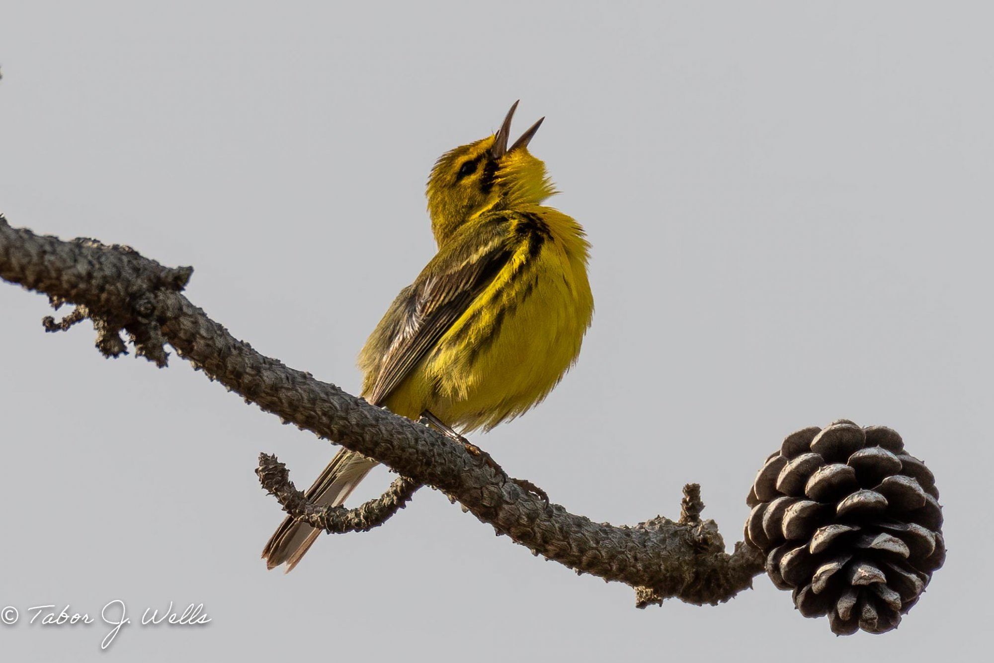
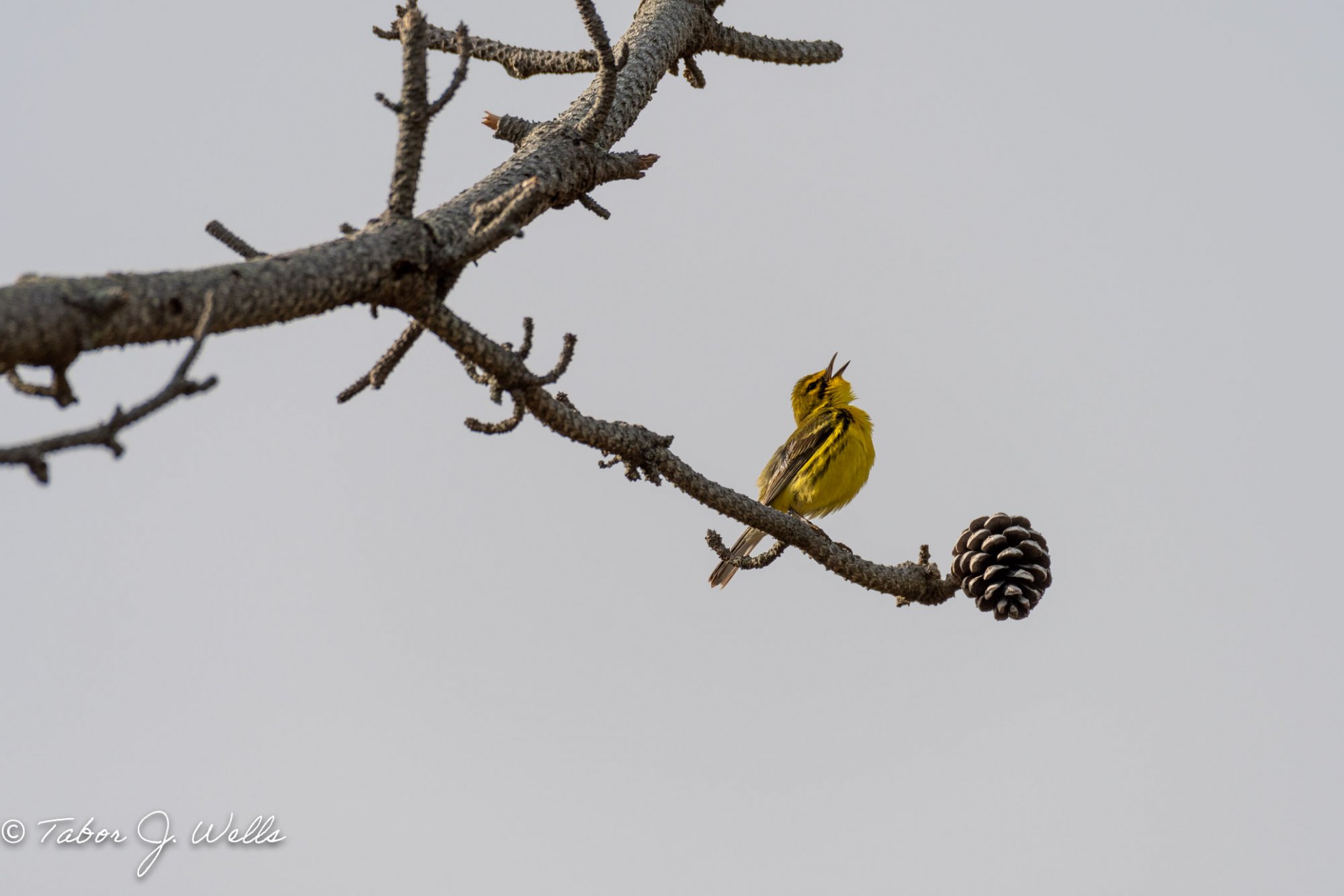
Hello all -- Here's a picture I took earlier this year that I'm thinking about printing on canvas. Before I do, I'd love to get some feedback about what tweaks I should try to make in LR or PS (I'm a novice at both). Included is the crop I'd like to print and the original image (with LR "Auto" adjustments applied). Thanks!

Edit: Replaced ProPhoto RGB versions with sRGB versions per @DRwyoming suggestion. Thanks!

Photo was shot with a Nikon D5200, 200-500mm, ISO 110 500mm f/6.3 1/1600

_DSC5985-Edit-4.jpg
You can only see EXIF info for this image if you are logged in.


_DSC5985-4.jpg
You can only see EXIF info for this image if you are logged in.
 
Last edited:
Odd... The color looks way more washed out on what I posted than when I view the same photo on my system using the same monitor. Why would that be? I exported from LR with ProPhoto RGB color space. Would the forum software treat that differently or something when processing uploads?
 
Last edited:
Odd... The color looks way more washed out on what I posted than when I view the same photo on my system using the same monitor. Why would that be? I exported from LR with ProPhoto RGB color space. Would the forum software treat that differently or something when processing uploads?
Web images are viewed in the sRGB color space. If you process an image in ProPhoto RGB or Adobe RGB 1998 and then view it through a standard browser (no color management) the colors will shift and generally not for the better. Best to convert all images intended for viewing on the web or in an email application to sRGB during export.

As to why it looks different on the same monitor, LR and PS are color managed applications and take into account the chosen color space when rendering the image. Web browsers and many consumer photo apps on computers (e.g. Photos in Windows) are not color managed and make an implicit decision to treat everything as some form of sRGB. So when they take those colors mapped to a wide gamut space like ProPhoto RGB and display it as though it was actually an sRGB image things tend to get muddy and lose saturation.

That said, when other's view your images on the web or in their email program the colors can again shift even if the image carries an sRGB profile as folks have very different monitors and the settings can vary quite a bit. Nothing you can really do about that part but for your own print workflow you can at least calibrate your monitor, be careful with your color space choices and make sure you embed the appropriate profiles if you send the file out for online printing so they're rendered from the appropriate color space.

In terms of edits, it's hard to say without seeing the image in the appropriate color space but I'd suggest some shadow recovery work to bring out features on the bird and perhaps some effort to bring the sky to a bit more blue rather than gray although that could be a result of the color space issue. It's a shame the lighting didn't give you any catchlight in the eye.

Also be careful of how big you decide to print this as that's a fairly substantial crop on the original image so you've cut away a lot of your pixels.

Nice moment you captured there and the scene with the bird singing and the pine cone is really nice.
 
Last edited:
Web images are viewed in the sRGB color space. If you process an image in ProPhoto RGB or Adobe RGB 1998 and then view it through a standard browser (no color management) the colors will shift and generally not for the better. Best to convert all images intended for viewing on the web or in an email application to sRGB during export.

As to why it looks different on the same monitor, LR and PS are color managed applications and take into account the chosen color space when rendering the image. Web browsers and many consumer photo apps on computers (e.g. Photos in Windows) are not color managed and make an implicit decision to treat everything as some form of sRGB. So when they take those colors mapped to a wide gamut space like ProPhoto RGB and display it as though it was actually an sRGB image things tend to get muddy and lose saturation.

That said, when other's view your images on the web or in their email program the colors can again shift even if the image carries an sRGB profile as folks have very different monitors and the settings can vary quite a bit. Nothing you can really do about that part but for your own print workflow you can at least calibrate your monitor, be careful with your color space choices and make sure you embed the appropriate profiles if you send the file out for online printing so they're rendered from the appropriate color space.

In terms of edits, it's hard to say without seeing the image in the appropriate color space but I'd suggest some shadow recovery work to bring out features on the bird and perhaps some effort to bring the sky to a bit more blue rather than gray although that could be a result of the color space issue. It's a shame the lighting didn't give you any catchlight in the eye.

Also be careful of how big you decide to print this as that's a fairly substantial crop on the original image so you've cut away a lot of your pixels.

Nice moment you captured there and the scene with the bird singing and the pine cone is really nice.

Thank you for the explanation re: sRGB. I wasn't aware that this was what happened with browsers. I'd figured since the same file uploaded to instagram and google photos shows with the colors I expected via web, that it would have here as well. I'll try re-exporting as sRGB and update the original post.

Re: the sky, sadly there was no blue that morning. That's a pretty accurate representation of the sky. It was a grey and overcast early morning before the haze burned off by mid-morning.
 
Is there a tutorial you'd recommend for adding catchlights for wildlife? I've never tried that before. Thanks!
Hi. I see you already have a catch light there. I would simply enhance it with a few local adjustments (highlights and blacks). Chealsea Northrup also did a tutorial on it A few years back. I’ll take a look...
 
Back
Top