RGB / SRGB

If you would like to post, you'll need to register. Note that if you have a BCG store account, you'll need a new, separate account here (we keep the two sites separate for security purposes).

Promapper

Greg
Supporting Member
I've done a search on this forum and have not found anything regarding rgb or srgb. Is there one definitive camera setting and post processing settings for final output? When to use either? When to you convert and the best way to do that?

I shoot RAW NEF files almost exclusively and edit it PS.

Thanks
 
The setting in camera affects only jpg and tiff files, not the raw files. To preserve as much information as possible for processing, you should stick to raw files, or 16 bit tiff files if you move between applications. For printing and publishing on the web, its best to use sRGB as that is most likely to stay consistent across devices. So from photoshop or other editors, when you’re ready to export a final image, export to sRGB jpg.
 
That is what I assumed. Is it normal for the sRGB to be of a lower contrast after export? It just doesn't have the same snap as the one that I edit in RGB.
 
Screen dsplays will differ both from make (not including calibration issues) to make and if they display sRGb or RGB. For any dislay fom a phone to a top monitor, sRGB is the profile that should be inbedded in the file. For me the biggest difference is in the way reds are shown.

I shoot in RAW and RGB and export jpgs as sRGB if they are going to be used for screen display as most are. Some printers also use sRGB, some work with RGB or other profiles.
 
That is what I assumed. Is it normal for the sRGB to be of a lower contrast after export? It just doesn't have the same snap as the one that I edit in RGB.

It really depends on the image and how AdobeRGB or ProphotoRGB is mapped to sRGB - and how clipped gamut is handled. AdobeRGB and ProPhotoRGB have more colors and tones, so they have smoother transitions between color variations. But with some colors, they have more colors at the darker or lighter tones. If sRGB does not have those colors, algorithms are used to move to colors that are within sRGB.

The other issue may be with your computer, monitor or printer. The actual color data is in the file. Your software has a working space for the colors it uses or renders, and it may be wider or smaller than the file can produce. As you edit, you shift color into space that may or may not be within the working space. Your monitor has it's own color gamut for what is displayed. If it is a laptop, it could be much less than sRGB, or with a wide gamut monitor, could exceed AdobeRGB in some areas. Then you output as a file for storage, printing or for the internet. Prints are viewed with reflected light while your computer monitor use backlit illumination - two very different approaches. Your printer has its own range of colors that it can produce, and its own was of converting out of gamut colors. For the internet, sRGB is the lowest common denominator, but some websites reprocess and resize your image. With all these variations, there is no one color space that works the same way for everything.
 
If you are shooting raw, the camera settings for colorspace are ignored by lightroom and Photoshop. Lightroom and camera raw automatically use a version of prophoto, the 'largest' color gamut rgb colorspace. Click the white words bottom middle in camera raw module to check the preferences. For Photoshop you can set it under edit/color settings and that can get complicated, but your default should be prophoto anyway if it is coming from camera raw from a raw camera file. Most people say use the largest (16 bit prophoto) until you have to convert to export. Adobe rgb is a medium size rgb colorspace, srgb is the smallest rgb colorspace but the internet 'speaks' srgb. Colors can look strange on the web if not in srgb.

In photoshop I work in 16 bit prophoto but convert when exporting. Check the bit depth under image/mode to make sure 16 is checked. For the internet use file/export as in photoshop to export a copy, and choose jpeg and click 'convert to srgb' and 'imbed profile.' There are other ways but this is easiest. For sending to a print service, your service will tell you what they accept. I use Bay photo and they ask for 8 bit jpeg or tiff converted to adobe rgb or srgb with the profile imbedded. They accept prophoto but don't prefer it. You convert under file/color settings before 'saving as' a copy. Some print services accept only 8 bit srgb jpeg so you have to check.

Possibly useful article and photoshop instructions.

 
Last edited:
sRGB (some times referred to as just RGB) offers the smallest color space. And when you are getting to JPEG it only supports 8-bit color, so a JPEG sRGB file will be the lowest color space that is available today (won't rule out that someone can find an obscure old format with less). But it's the one supported by all browsers on all platforms. So for presentation you can't avoid it.
Let your work stay in 12-14-16-bit with AdobeRGB/ProphotoRGB as long as possible and only convert to JPEG as the last task before publishing.
 
That is what I assumed. Is it normal for the sRGB to be of a lower contrast after export? It just doesn't have the same snap as the one that I edit in RGB.
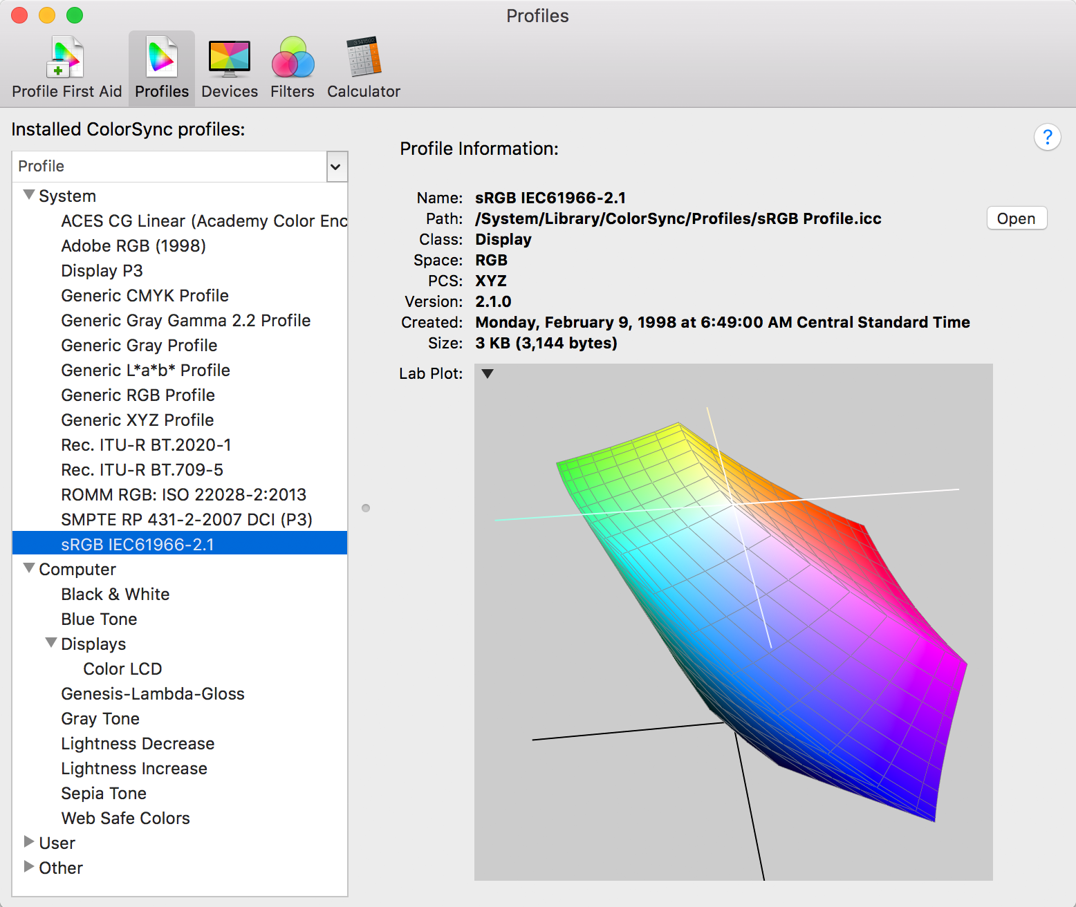
I'm not really following you here. There really isn't a simple RGB color space. There's many variants on RGB like sRGB, Adobe RGB 1998, ProPhoto RGB and others but RGB without any qualifiers isn't to the best of my knowledge an ICC defined color space.

Do you perhaps mean sRGB vs Adobe RGB 1998 or something like that? If that's the case then yeah Adobe RGB 1998 is a wider gamut color space and can render a wider range of Red, Green and Blue colors. It's a great color space for doing editing work as you've got a very wide gamut to work with (which you can think of as a much larger box of crayons with more shades of each color) but when it comes to output you want to make sure the final file can be well reproduced by your chosen output medium.

For instance when printing you want to make sure your image as edited can be reasonably reproduced on the paper, metal or cloth type you're printing on via the chosen print process. Soft proofing or small hard proof test images can help in terms of figuring out if the image as processed is too far outside the gamut of your print process and colors will be changed to the point of degrading the image. So even though working in a wide gamut color space for editing gives you the most creative latitude it also creates risks that the edited image won't be reproducible in your preferred output medium and after soft or hard proofing you may need to tune down some of your edits so the final output looks the way you want.

But for web use the standard color space is sRGB and images destined for the web should be converted into that space prior to use on the web. If you just post say a wide gamut Pro Photo RGB image that has been edited to occupy that wide gamut (highly saturated RGB tones filling much of the available color gamut) without conversion the resulting image viewed in non color controlled web viewers will typically look very flat with poor colors and poor contrast. So it's important to actually convert the image to sRGB using a good conversion engine like you'll find in Photoshop, Lightroom or other color managed image editors before posting on the web.

The trouble is that even after paying attention to all of that the same well edited image can look very different on different screens depending on the design and quality of the monitor and whether it's been color calibrate. So even if you do everything right in terms of color management your images can look really different to different users depending on their screens and screen settings. Not much we can do about that.
 
It really depends on the image and how AdobeRGB or ProphotoRGB is mapped to sRGB - and how clipped gamut is handled. AdobeRGB and ProPhotoRGB have more colors and tones, so they have smoother transitions between color variations. But with some colors, they have more colors at the darker or lighter tones. If sRGB does not have those colors, algorithms are used to move to colors that are within sRGB.

The other issue may be with your computer, monitor or printer. The actual color data is in the file. Your software has a working space for the colors it uses or renders, and it may be wider or smaller than the file can produce. As you edit, you shift color into space that may or may not be within the working space. Your monitor has it's own color gamut for what is displayed. If it is a laptop, it could be much less than sRGB, or with a wide gamut monitor, could exceed AdobeRGB in some areas. Then you output as a file for storage, printing or for the internet. Prints are viewed with reflected light while your computer monitor use backlit illumination - two very different approaches. Your printer has its own range of colors that it can produce, and its own was of converting out of gamut colors. For the internet, sRGB is the lowest common denominator, but some websites reprocess and resize your image. With all these variations, there is no one color space that works the same way for everything.

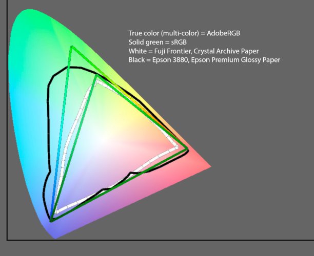
As Eric says, the choice of a color space depends on many variables. The first consideration would be the color gamut of the scene to be captured. Pointer's gamut encloses most real world surface colors and is discussed in some detail here. sRGB does not cover this gamut, but AdobeRGB covers most of it. If the scene does not contain many saturated colors, sRGB would be OK.

Another consideration is the gamut of one's output device. Standard monitors are more or less sRGB, but wide gamut monitors are increasingly used and cover AdobeRGB. Today's inkjet printers have a wide gamut that exceeds AdobeRGB in the greens and teals as shown in this xy plot which shows the gamut of an 3880 Epson printer outlined in black. If you are printing to one of these inkjets, you should use at least AdobeRGB. Many printers at the corner drugstore or Walmart have a gamut approximating sRGB as shown in white on the plot for a Fuji Frontier printer that was used by my local Costco before they discontinued this service. sRGB would be fine here, but you could gain some advantage by working in a wider space and using rendering intents to map the colors to the gamut of the printer.

Sixteen bit ProphotoRGB is the preferred space for experienced photographers, but it must be used with care as with its wide gamut colors can easily be pushed beyond what can be viewed on screen or printed. One can always convert to sRGB from ProphotoRGB, but the reverse is not true. Andrew Rodney has a good video covering the limitations of sRGB.

Cheers,

Bill
Gamuts2.jpg
 
Last edited:
I've done a search on this forum and have not found anything regarding rgb or srgb. Is there one definitive camera setting and post processing settings for final output? When to use either? When to you convert and the best way to do that?

I shoot RAW NEF files almost exclusively and edit it PS.

It's very important to distinguish between choosing the ideal working color space for editing and choosing the ideal output color space for saving a final image.

A few commenters have mentioned ProPhoto RGB. That is a great working color space to do your edits in (which is why LR & ACR use it). But it's also a horrible choice as an output color space unless you can guarantee your viewers have a color-managed workflow and a device with a large gamut.

Ultimately your best output color space for exporting a final image will depend on your intended use:
  • Sending to your own printer in a color managed workflow? Keep it in ProPhoto RGB or Adobe RGB.
  • Sending to a 3rd party printing service? Vast majority require sRGB only. Check their support docs.
  • Using a recent Mac and just want the photos on your iPhone/iPad? They have all supported Display P3 for years, so that would be the best choice.
  • Posting to the web? sRGB only. Most computer users don't have a color managed workflow.
  • Sharing files with lay people? sRGB only. Unlikely they will have a color managed workflow.
Some resources:
https://www.adobe.com/digitalimag/pdfs/phscs2ip_colspace.pdf
https://www.cambridgeincolour.com/tutorials/color-spaces.htm
https://www.amazon.com/dp/0321267222/?tag=backcogaller-20
https://www.amazon.com/dp/0240806492/?tag=backcogaller-20
 
Back
Top