Working in the LAB color space opens up some interesting possibilities but I mostly use it for adding color contrast to images that have a lot of similar colors. It's not the same thing as just bumping up a Saturation slider and it's not something to apply to every image as it can make images that already have a lot of colors look garish but for images with a lot of very similar colors it can open up possibilities.
Dan Margulis has written quite a bit about using the Lab color space in useful ways including this classic book:
https://www.amazon.com/dp/0321356780/?tag=backcogaller-20
The basic idea is that the LAB color space represents images with a single lightness channel (L) and then an A and B color channel with a representing the green to magenta range of colors and b representing the blue to yellow range of colors instead of the more typical Red, Green and Blue representation of an image. So if you convert an image from RGB into LAB in Photoshop you can then add a Curves layer and steepen the slope of a straight line curve in the A and B channels to increase color contrast. Then you convert the image back to RGB for any remaining processing or for saving.
Here's a typical example using a sandstone Canyon image. The right hand image has no additional Saturation added, it has LAB space curves applied that do saturate the colors but more importantly pulls similar colors a bit further apart from one another (adds color contrast). Again, I pushed this image pretty hard to illustrate the point and it's easy to be a lot more subtle.
View attachment 24526


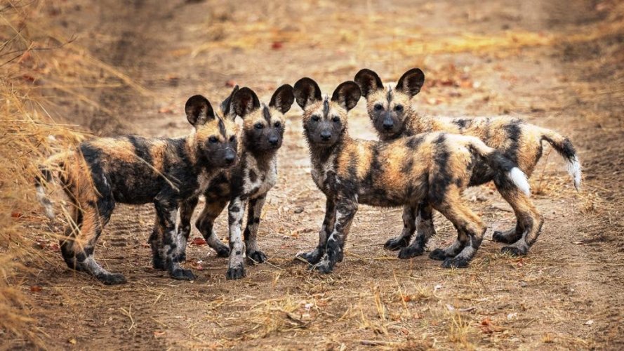
") Below is the uncropped version on LR and below that from NX Studio showing focul point. Perhaps focul point could have been on their eyes and instead of Dynamic (Matrix) area AF I could have used single-point AF? (Does anyone know how to show focul point in LR for Nikon Z6?)
Below is the uncropped version on LR and below that from NX Studio showing focul point. Perhaps focul point could have been on their eyes and instead of Dynamic (Matrix) area AF I could have used single-point AF? (Does anyone know how to show focul point in LR for Nikon Z6?)