Another question concerning Steve's video

If you would like to post, you'll need to register. Note that if you have a BCG store account, you'll need a new, separate account here (we keep the two sites separate for security purposes).

My usual "technique" is to brighten the bird and darken the BG. I use a number of methods to obtain that result. However, watching Steve's video yesterday made me wonder about the opposite approach. Darken the bird and brighten the BG. Unfortunately most of my images do not lend themselves to that approach as I often am fighting low light levels to start with. In this image of a Slaty-backed Nightingale-Thrush, in ACR, I brought down the BG and brought up the bird. I had to balance keeping the bird "black" with increasing the brightness. Shot with ISO of 2000 on Canon R5.
My question is: is the overall image too dark? Any other suggestions?
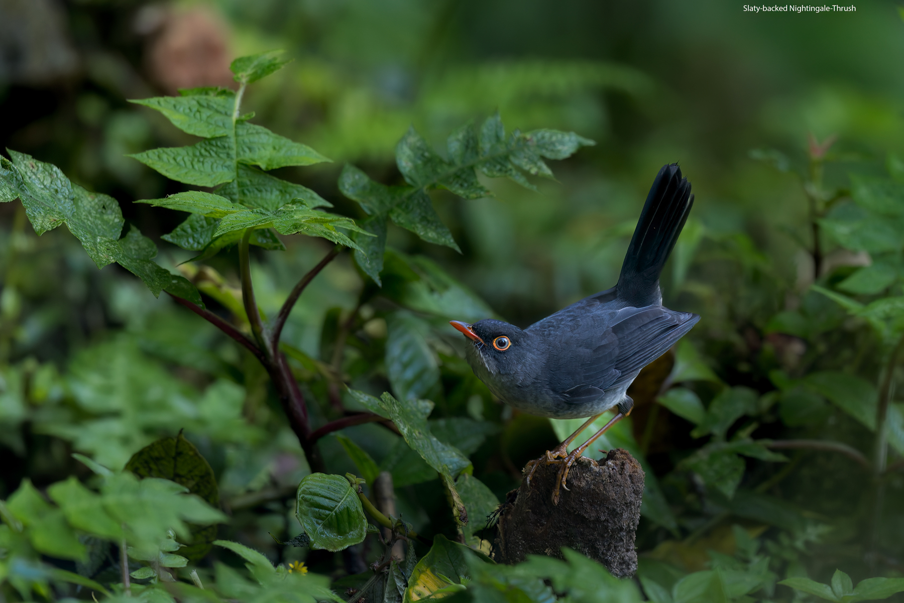
Slaty-backed-Nightingale-Thrush.jpg
You can only see EXIF info for this image if you are logged in.
 
My question is: is the overall image too dark? Any other suggestions?
Not to my eyes. I think the image works in part because of that beautiful eye ring that draws the viewer right to the eye.

I might try a crop that loses the dark corner in the upper left as I don't think that helps the image but I love the way the bright eye draws you in and makes a dark bird jump from a fairly dark background.

My usual "technique" is to brighten the bird and darken the BG
Whether or not that's the best approach really depends on the image and especially the light on the scene. I also shoot a lot on overcast days or shoot into shadows fairly often to avoid harsh light. In situations like that your approach can often make sense as the main subject is often helped with a shadow pull in lighting like that. But in more direct light or with brighter main subjects or if the background is already quite dark then other approaches would likely make more sense.
 
My usual "technique" is to brighten the bird and darken the BG. I use a number of methods to obtain that result. However, watching Steve's video yesterday made me wonder about the opposite approach. Darken the bird and brighten the BG. Unfortunately most of my images do not lend themselves to that approach as I often am fighting low light levels to start with. In this image of a Slaty-backed Nightingale-Thrush, in ACR, I brought down the BG and brought up the bird. I had to balance keeping the bird "black" with increasing the brightness. Shot with ISO of 2000 on Canon R5.
My question is: is the overall image too dark? Any other suggestions?
a) Not to my eye; as mentioned in the previous comment, the eye, particularly that bright orange around the eye, draws your attention immediately to the bird. b) If it were me, I'd take a look at adding a slight vignette to the corners to darken it gradually toward the edges or I would selectively darken the large brown area in the upper left portion of the image as it competes for attention.
 
Not to my eyes. I think the image works in part because of that beautiful eye ring that draws the viewer right to the eye.

I might try a crop that loses the dark corner in the upper left as I don't think that helps the image but I love the way the bright eye draws you in and makes a dark bird jump from a fairly dark background.


Whether or not that's the best approach really depends on the image and especially the light on the scene. I also shoot a lot on overcast days or shoot into shadows fairly often to avoid harsh light. In situations like that your approach can often make sense as the main subject is often helped with a shadow pull in lighting like that. But in more direct light or with brighter main subjects or if the background is already quite dark then other approaches would likely make more sense.
Thank you. My wife pointed out that the bright leaves between the bird's legs was distracting to her so I have reworked that area. Here is the new post. Later I will try some different crops and see how I like that.
Slaty-backed-Nightingale-Thrush.jpg
You can only see EXIF info for this image if you are logged in.
 
Not to my eyes. I think the image works in part because of that beautiful eye ring that draws the viewer right to the eye.

I might try a crop that loses the dark corner in the upper left as I don't think that helps the image but I love the way the bright eye draws you in and makes a dark bird jump from a fairly dark background.


Whether or not that's the best approach really depends on the image and especially the light on the scene. I also shoot a lot on overcast days or shoot into shadows fairly often to avoid harsh light. In situations like that your approach can often make sense as the main subject is often helped with a shadow pull in lighting like that. But in more direct light or with brighter main subjects or if the background is already quite dark then other approaches would likely make more sense.
With a recrop I lose a little bit with the bird's position in the frame. Not sure I like this one as much, but what do you think?
Slaty-backed-Nightingale-Thrush.jpg
You can only see EXIF info for this image if you are logged in.
 
It kind of gives it a painterly impact. To my eye the subject is the bright group of leaves top left, my eyes go there first and then to the bird, and the bird pointing in the direction of the leaves makes me wonder what is important about those leaves that the artist wants me to look at them twice. So there is a nice tension there.
 
I like the overall feel to the darker look. To me it suggests a bird feeding in low light, perhaps trying to get one last meal before nighttime sets in or feeding in a dark forest. It has a message. In a way it takes the image beyond a straightforward ID shot.

Just playing around with two finger zooming in and out of the second image on my iPad and having that take up the screen, I personally would crop in even more than you have. I would generally place the bird in the right half and the main plant in the left half. The top of the frame would completely cut out the brown in the top left corner and crop out where the leaf is gone from the leafy stem of the plant to the bird’s left. Depending on how wide I wanted things to be, I would either eliminate the green on the stump it stands on or leave just a hint of green on the bottom. I like the overall exposure and feel the exposure gives the image, though.
 
I think the crop depends on exactly what you want to convey with the image. I tend to gravitate toward more environmental shots so the wider crops really caught my eye. The tighter crop really calls out the bird as the star of the show. Either are good and I would have been happy to shoot this image and present either crop you have here. I like what you're doing here and that is a beautiful bird.
 
The place that I've found that brighter backgrounds work is in situations like Jan Wegener presents a lot (see his YouTube channel). I tried the light background approach earlier and it worked... kind of. My background was all very out of focus - you couldn't see any detail at all - I think this is somewhat necessary for the light background approach. However my problem initially was that my background had various gradations of dark and light green. The light background style works if the entire background has just about zero detail - that way the eye doesn't have anything to latch on to except the subject. As soon as the light background has some amount of variation, the eye can catch that variation and get stuck there. To see my "close but no cigar" attempt at a light background check out this post.

In your photo, I think you've made the right call by going with the darker background approach.

I personally like the second crop - for some reason on the first crop that brown blob catches my eye, but in the tighter crop the brown blob doesn't grab my attention nearly as much.
Jan certainly does like the light, almost pastel, BGs. His images always remind me of a Japanese ceramic painting. Beautiful for certain, but not my preference. I also have a tough time with light BGs. Usually my shots end up looking washed out rather than striking.
 
Back
Top