Bufflehead Flapping it's Wings

If you would like to post, you'll need to register. Note that if you have a BCG store account, you'll need a new, separate account here (we keep the two sites separate for security purposes).

Working on some old shots and thought this one was fairly decent, would appreciate any feedback.
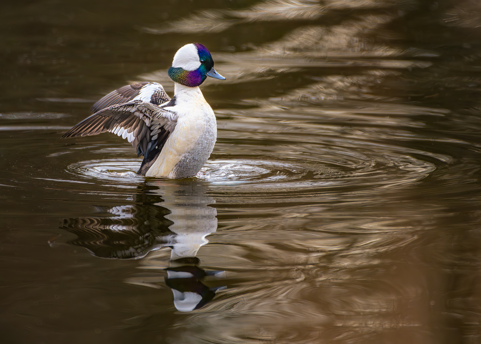
2023-12-24 A YOUNG BUFFLEHEAD DUCK WITH COLORFUL HEAD FEATHERS FLAPPING ITS WINGS WITH A REFLE...jpg
You can only see EXIF info for this image if you are logged in.
 
I like the richness of the full tonal range, the saturation of the colors on the head/neck contrasting with the less saturated water, and the sense of frozen motion from the duck and the moving water. Nice having the full reflection and some room for the reflection to breathe. On the cons, just the blown out areas where the feather detail is lost. There might be some ways to address that.
 
Quite a nice image in my eyes! Very interesting pose with engaging water movement and reflection. I'd be very happy with the image.

If you want to play, you might try warming up the image to suggest early or late evening light.....might work - might not.
 
Great stopped action in a nice pose. I love the colors in the head. Nice reflection in the ripples. I don't think the highlights are blown out, but they could benefit from a bit more detail. That can sometimes be achieved in Lightroom by pulling down the Highlights. Texture and detail rendering is not that great, which I think is because the subject was small in the frame. Was it a heavy crop? You did very well with what you had. The color of the water is a bit off-putting, but that's probably what it was.
 
Thanks all for the positives and the suggestions, I will try them to see how it works. It was a bit of a large crop.

I like the idea of warming it up for a light evening look.

Again thanks all.
 
Great stopped action in a nice pose. I love the colors in the head. Nice reflection in the ripples. I don't think the highlights are blown out, but they could benefit from a bit more detail. That can sometimes be achieved in Lightroom by pulling down the Highlights. Texture and detail rendering is not that great, which I think is because the subject was small in the frame. Was it a heavy crop? You did very well with what you had. The color of the water is a bit off-putting, but that's probably what it was.

Where the wing meets the body, for example.
 
Wow! Beautiful duck. We have these guys in Virginia but sightings are rare where we live. They get confused with hooded mergansers occasionally. The iridescent colors in the head feathers is an impressive capture….. well done!
 
Working on some old shots and thought this one was fairly decent, would appreciate any feedback.

View attachment 76977
This is a very neat shot, Buffleheads are very shy water ducks, and these birds have excellent vision; also it's difficult to get the full iridescence of the head feather due to the highly reflective nature, I wouldn't mind sacrificing a little high light. You might try to get some photos under a cloudy sky.

Oliver
 
Where the wing meets the body, for example.
Yeah, it is very bright there, as high as 98% according to LR. What does "blown out" mean? I always thought it meant 100%. There seems to be continuous tone in that whole area... so not blown out depending on your definition, but very bright and deficient in detail.

I don't think much detail is recoverable using the Highlights slider (contrary to my earlier suggestion) because there isn't much there in the original.
 
I think some detail-less specular highlights and small areas can look pretty cool, but on the subject one might not want too much. I guess the way I judge it is if I try to pull it left it just goes detail-less gray. If the feathers would have detail under normal exposure but now they don't, then overexposure happened or the artist pushed it too far right in post. Or maybe the screen I using.
 
Back
Top