You are using an out of date browser. It may not display this or other websites correctly.
You should upgrade or use an alternative browser.
You should upgrade or use an alternative browser.
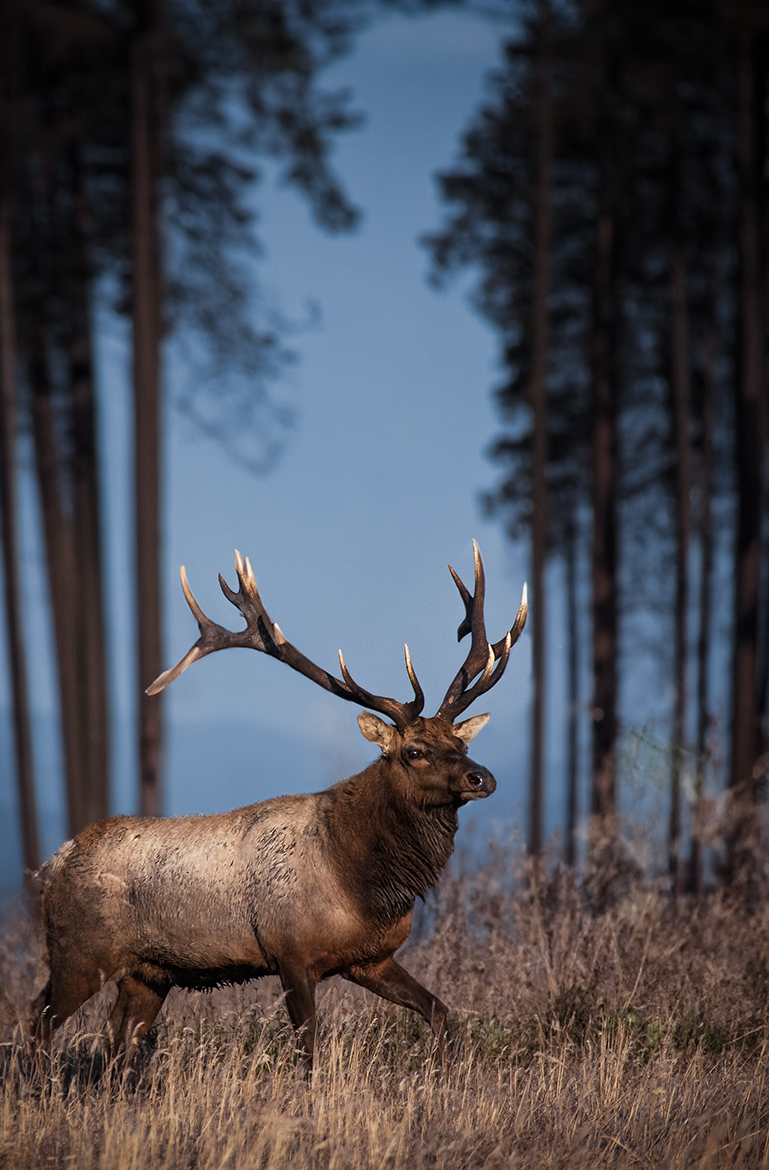
Entering in contest, Need Critique (Tule elk)
- Thread starter Egan
- Start date
If you would like to post, you'll need to register. Note that if you have a BCG store account, you'll need a new, separate account here (we keep the two sites separate for security purposes).
It's tough to tell, but the first one seems OOF. The second one seems much sharper and the subject has an interesting pose. Also the eye seems very sharp and the catch light makes it stand out! I really like the second one.
I agree the second looks sharper, but I like the background in No1.
Either way, for someone who by the sounds of it hasn’t been doing it long you’ve done a great job, well done & keep posting.
Trying not to hurt feelings, but critiques are for honest responses. Number 1 has too many distracting tangents coming into play with the subject. Number 2 has fewer, but maybe consider cropping away some of that foreground brush At the bottom, and if permitted, remove the few trees that would allow a full open window behind. For a contest I would say definitely an "almost." It's hard to compose when the subject might move at any moment. But after getting a shot think about repositioning, in this case so the elk was fully framed by the window of open sky behind.
Agree with @bleirer. Here are my nitpicks and things I would play with:
Crop the left side slightly to put less space behind the buck and give him a place to run. Perhaps a taller aspect ratio of the frame might give it a grander feeling. Crop out a bit of the foreground. Add a slight vignette (0.5 stops) centered on the buck (depending on contest rules)…Make sure it’s subtle and not obvious. Also, maybe straighten the image and/or transform it so the trees don’t look like they are falling over backwards. Trying juicing the saturation. DeHaze might bring out a bit more drama in the background.
This image doesn’t need much so go easy on any adjustments you will make.
I hope this helps.
SCoombs
Well-known member
I'd say the first one is not worth entering as it just looks a bit like a snapshot, but the second is actually pretty good. The composition is eye catching, the pose is interesting, and the background, while not perfect, is not half bad either. I've made a fast edit of the file you uploaded just to demonstrate an example of how it can be even better with some adjustments. I do think that, if allowed, removing a few of the trees would make it look better, too. I was going to do a quick example of that but for some reason Photoshop isn't allowing me to do anything to them - perhaps if I were working with the original file it would work better. Also, it does look like the copy uploaded may have had some significant changes to its resolution or excessive sharpening applied at some point, so while my edit can give a sense of how slightly different levels for tones and colors may improve the image, working on the original file you'd probably get a much better result.
|
You can only see EXIF info for this image if you are logged in.
Original |
You can only see EXIF info for this image if you are logged in.
Sample edit |
raptor photo
Well-known member
2nd one by a mile. Great shot! Fix the white balance and crop and you have a very good competitor in the contest!
I took all of your suggestions to heart, and cut the first photo. for the second photo, i did some adjustments to the light, WB, and geometry of the trees. here's how it looks so far.

You can only see EXIF info for this image if you are logged in.
Thanks for the critique!raptor photo
Well-known member
Much better! I'd warm it up a little more, brighten up the shadows, and add some more room on the left side
When you crop an image - it is usually advisable to stick with certain ratios - and not crop at random - it's not cast in stone but I mention this as I think it is important to not have one's crops all over the place - if I am correct - the 2nd photo was cropped first time round.
The second photo is definitely a lot more pleasing. If you are interested - join the local photo club - enter your photos - usually, it's a show and tell and crit kind of thing, on a regular basis - and this will give you the opportunity to get really good crit - as well as learn from crit on other people's photos. You don't necessarily know something is wrong unless someone tells you. Enter competitions - especially if it comes with feedback given when they judge it.
The second photo is definitely a lot more pleasing. If you are interested - join the local photo club - enter your photos - usually, it's a show and tell and crit kind of thing, on a regular basis - and this will give you the opportunity to get really good crit - as well as learn from crit on other people's photos. You don't necessarily know something is wrong unless someone tells you. Enter competitions - especially if it comes with feedback given when they judge it.
First one is decent but not great, however second one is very nice. I would enter just the second.
Looks amazing. Love the lighting.
My reactions:
Buck is cropped a little tight to the behind. Maybe back it off a bit. Looks a little crowded, now.
And, the trees still look splayed out towards the top which seems weird…Did you try the vertical transform to make the trees more parallel to each side? Experiment, maybe. Maybe I’m wrong about this.
I think this should place.
I agree that the crop is too tight on the left. The aspect ratio in Post #6 looks fine to me. The angle of the trees doesn't bother me as it appears the elk is on a bit of a small rise. The Processing on #8 looks good to me....very natural and not over done.
Make sure you check the contest rules to see what kind and amount of post processing is allowed before submitting.....
Make sure you check the contest rules to see what kind and amount of post processing is allowed before submitting.....
The_Wild_Chesapeake
New member
I think the edit on the right went way overboard. It looks like the elk was captured with flash. I would say the only thing it needs is a little spot brightening of the head and neck where the darker fur is. A global edit like this turned the grass into orange mush.I'd say the first one is not worth entering as it just looks a bit like a snapshot, but the second is actually pretty good. The composition is eye catching, the pose is interesting, and the background, while not perfect, is not half bad either. I've made a fast edit of the file you uploaded just to demonstrate an example of how it can be even better with some adjustments. I do think that, if allowed, removing a few of the trees would make it look better, too. I was going to do a quick example of that but for some reason Photoshop isn't allowing me to do anything to them - perhaps if I were working with the original file it would work better. Also, it does look like the copy uploaded may have had some significant changes to its resolution or excessive sharpening applied at some point, so while my edit can give a sense of how slightly different levels for tones and colors may improve the image, working on the original file you'd probably get a much better result.
View attachment 67949
OriginalView attachment 67950
Sample edit
SCoombs
Well-known member
I think my edit could be refined. As I said, it was extremely quick and aimed at giving a rough example of ways the photo could be touched up. It was also made with the assumption that the OP has a better quality original to edit as the file that was posted has problems with texture and resolution. It looks like it's been extremely over sharpened or blown up or otherwise been stripped of clarity and detail. I think the grass in the front would benefit from the sorts of edits done here and look at lot better assuming those edits were done on an original file without these issues. I do think it's a little over brightened, especially now looking on a cell phone (which is probably making it a lot worse than it is) but in part I think was trying to make sure the edits were noticeable to emphasize the sorts of things that could be done to someone who sounds like they may not have worked with this stuff much before and so I made a conscious decision not to practice much restraint.I think the edit on the right went way overboard. It looks like the elk was captured with flash. I would say the only thing it needs is a little spot brightening of the head and neck where the darker fur is. A global edit like this turned the grass into orange mush.
Not to be picky, but this is a bull elk rather than a buck.
Nice photo.
Nice photo.
DBalaur
Member
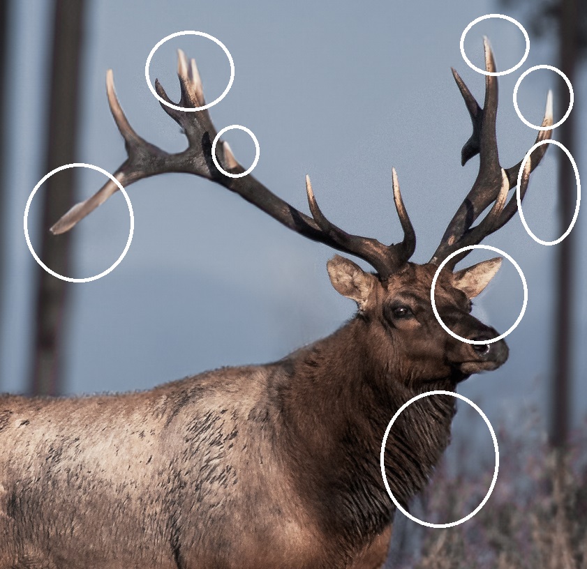
I echo the opinion that you should focus your effort on polishing the second shot. Aside from the adjustments others have mentioned, I noticed a lot of weird artifacts, especially around the elk head, which is bad because that's where most people will gravitate their attention toward. Did you apply a subject/background mask with extra blurring to increase subject separation? You might need to refine your masks if that is the case.

You can only see EXIF info for this image if you are logged in.
I like the redo of the 2nd pic much better but it appears a little over processed. Some of the hair seems over sharpened, it stands out too much. The clarity may be a bit high and causing that. The black seems very dominant in the trees and in the elk, the clarity may play a part in that also. It's your art, though, if you like it better that way you should post it like that. Overall, it's a pretty good pic.

