Is this ready for print?

If you would like to post, you'll need to register. Note that if you have a BCG store account, you'll need a new, separate account here (we keep the two sites separate for security purposes).

Ok, first post!
Wanting to get a couple of prints made for the people who allowed me to use their property for access to a nesting pair of eagles.
Is this ready to go?
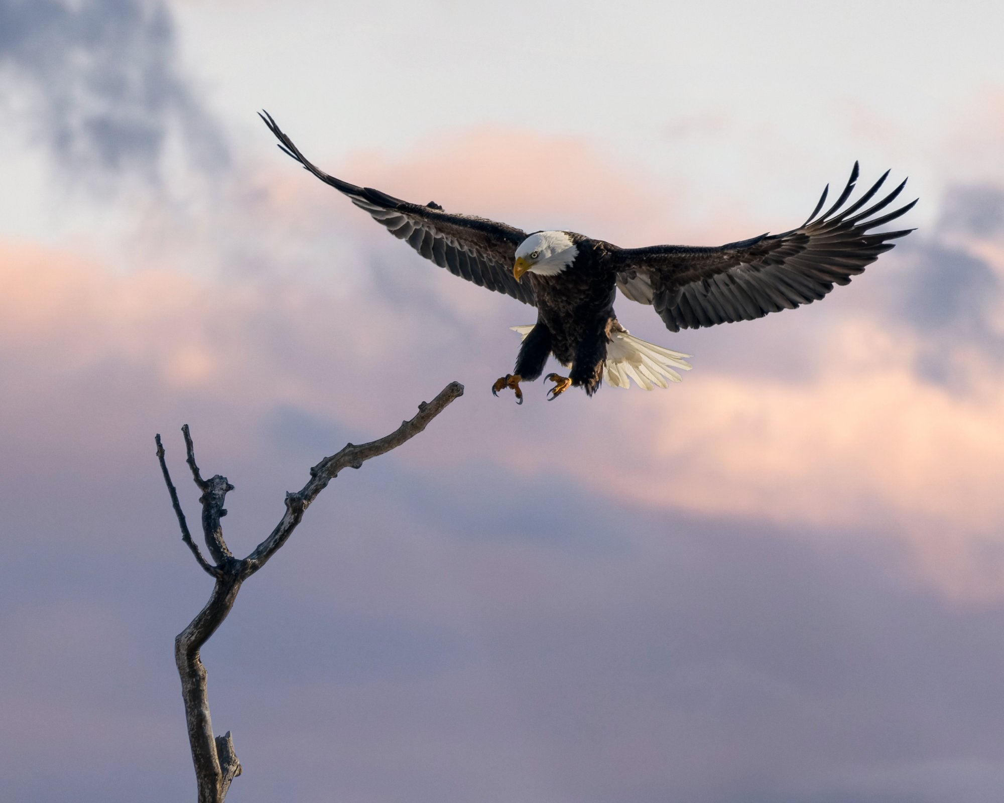
DSC_2056-EagleSunset.jpg
You can only see EXIF info for this image if you are logged in.
 
Beautiful, beautiful photo! My only suggestion would be to lighten the eagles face just a little, if possible. The colors are lovely, great action, technically great, and such a beautiful moment.
 
Thank you for your comments and insight. I struggled with whether or not to lighten the face / raise shadows more or not.
I have been watching this guy and his mate for several months and have captured many shots of them in this time but none that lined up multiple elements like this.
 
  • Like
Reactions: JSD
I agree with a bit of subtle dodging on the face. I'd also add a slight vignette (edge burn) especially if you'll frame the print with a white or light colored mat board. The bright highlights around the edges and especially in the sky can pull the viewer's eye away from your main subject.

Great image. I really like the action, the composition and the background. Nicely done!
 
  • Like
Reactions: JSD
Thank you so much for your comments.
These are the things I need to hear. I totally see what you mean now about the vignette even though I didn't without your recommendation.
 
Even on a calibrated monitor, I would offer to make the photo a touch brighter or add some brilliance / vibrance for print. Print is a "reflected" media where your monitor is a "backlit" media. My experience with making prints is they tend to appear a little darker than how they look on the monitor.

Don't overdo it, just a subtle touch of brilliance or vibrance or brightness depending on the software you're using and your personal preference.

As others have said, it's a beautiful photo.

Jeff
 
I think it looks fine the way it is. If you lighten the face, you will blow out the top of the head which is already borderline.

Raise shadows too much and it starts to look ugly. Isn't this what was there, as you see it right now? I like it.
 
I wouldn't change a thing. Unless those folks are photography aficionados they will never know the difference and will be blown away by this great shot!
 
@Gene_Hughes "Ok, first post! Wanting to get a couple of prints made for the people who allowed me to use their property for access to a nesting pair of eagles. Is this ready to go? "
Gene, be careful with this one! It is so beautiful and the shot so perfectly timed that there will be people accusing you of trying to misrepresent a painting as a photo you took!
🤣🤣👍 And BTW, personally, I think the tree is a valid part of the story the photo is telling. So 1 vote to keep the tree.
 
Even on a calibrated monitor, I would offer to make the photo a touch brighter or add some brilliance / vibrance for print. Print is a "reflected" media where your monitor is a "backlit" media. My experience with making prints is they tend to appear a little darker than how they look on the monitor.

I agree with this.
In order to keep the look homogenous and natural, I would simply raise the overall exposure rather than selectively brightening the face.
 
Last edited:
Back
Top