Moss Landing Harbor - Misty Morning

If you would like to post, you'll need to register. Note that if you have a BCG store account, you'll need a new, separate account here (we keep the two sites separate for security purposes).

I created this image early morning, while out looking for birds, sea otters, and harbor seals. I really liked the light.

Constructive comments much appreciated.
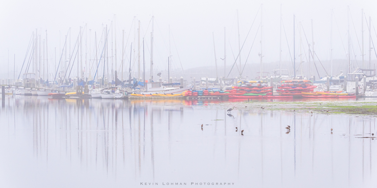
Moss Landing Harbor Morning Mist - Kevin Lohman.jpg
You can only see EXIF info for this image if you are logged in.
 
I like it, pretty scene. if anything just a tad bright imho maybe a little less would be easier for the eyes to adjust, maybe a bit of contrast.

Note- I am not a pro
 
Last edited by a moderator:
What a gentle, soft photograph. You asked for constructive comments, and if this were my image, I might consider removing the post next to the edge on the left....... by cloning, or by a slight crop, and removing the rightmost group of birds on the right foreground...........just to remove any distractions close to the edges. The image is wonderful, and you could do several other things, just as a trial........you could soften it, you could create a sketch with it, or turn into a black and white and add some more haze, or even add a colored filter to represent sunrise or sunset colors. I like the peacefulness of this image.
 
What a gentle, soft photograph. You asked for constructive comments, and if this were my image, I might consider removing the post next to the edge on the left....... by cloning, or by a slight crop, and removing the rightmost group of birds on the right foreground...........just to remove any distractions close to the edges. The image is wonderful, and you could do several other things, just as a trial........you could soften it, you could create a sketch with it, or turn into a black and white and add some more haze, or even add a colored filter to represent sunrise or sunset colors. I like the peacefulness of this image.
Thanks so much, Wanda. I may play around with crop slightly. I included the post on the left to anchor the bridge, but I can see it working without that, too. And I left the birds in because I did not want to clone anything out, since I may want to enter this into some contests. But I see what you mean about them. I may play with some of those things for my own benefit. I appreciate you taking time to provide such thoughtful comments.
 
Thanks so much, Wanda. I may play around with crop slightly. I included the post on the left to anchor the bridge, but I can see it working without that, too. And I left the birds in because I did not want to clone anything out, since I may want to enter this into some contests. But I see what you mean about them. I may play with some of those things for my own benefit. I appreciate you taking time to provide such thoughtful comments.
Beautiful image, I agree the high key works nicely. I'd probably try cropping out the post, since it's one of the darkest 'anchors' to this high key image it sort of drags the eye right to the edge of the frame. I might also put a subtle vignette (or a touch more vignette) on the image to hold the viewer a bit but not so much that it's obvious.
 
More I look at it the more I like it, being a new-be I thought it was a mistake but now can appreciate what your going for (never considered High Key landscape) and with Wand's composition suggestions ---- cool Thanks everyone...
 
Beautiful image, I agree the high key works nicely. I'd probably try cropping out the post, since it's one of the darkest 'anchors' to this high key image it sort of drags the eye right to the edge of the frame. I might also put a subtle vignette (or a touch more vignette) on the image to hold the viewer a bit but not so much that it's obvious.
Thanks! I am definitely going to try those things. It may end up being subtle, but any improvement is always nice.
 
Back
Top