Nuthatch photo - reactions?

If you would like to post, you'll need to register. Note that if you have a BCG store account, you'll need a new, separate account here (we keep the two sites separate for security purposes).

Would love to get some feedback; thanks!
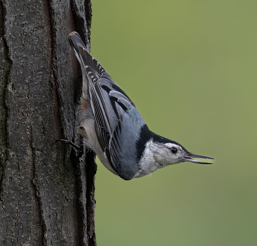
DSC_0692-Edit-Edit-Edit-2.jpg
You can only see EXIF info for this image if you are logged in.
 
Good exposure and sharp. If it's cropped I'd open it up a bit more. Get the bird's eye closer to center so it has some dead space to look into. Also, not sure if it's me, but there is some weird anomaly in the area of the beak. Like the BG was dodged between the top and bottom of the beak. Nice shot all in all, just needs to be opened up on the right side a bit.
 
I think it's pretty nice. Looking for things to critique since you put it in the critique department:

- is that a bit of chromatic aberration on the feathers and upper body, or is that just how the nuthatch shimmer?

- maybe a little too sharpened?

- on the composition I think you can crop a bit of the tree. It dominates visually. If you took half off to me it would focus attention on the bird.

Nitpicking I know.
 
Good pose, really nice soft light with a clean background, however there needs to be more space for the bird to look in to, and there's a little too much tree trunk on the left side. If the right side of the photo is already at the edge of the frame you can expand the canvas in Photoshop. I think Steve has a video about that. Also, like grossidm mentioned it looks like you forgot to dodge the background between the upper/lower mandibles. It also looks over sharpened but that might just be due to compression or some other factors.
 
It's a nice shot. Per comments already made by others IMO it would benefit from bit cropped off the left and if there's room add a bit to the right to pull the bird's head closer to center.
 
I don't think the square crop works. Did you try just a standard 2x3 aspect ratio......horizontal?

Nuthatch v3.jpg
You can only see EXIF info for this image if you are logged in.
 
For me, the 2x3 has a little too much room on the right. I'd go 8x10. Of course it's all subjective, and I quite liked your original, as well.

The composition, clean background and nice light make for a great shot. Nice job. :)
 
Here's the 8 x 10 - and good news; my wife likes it! :cool:

View attachment 42099

That's looking real nice! Plus you fixed the color/ca issues. Personally I'd still include a little less of the tree. Just my two cents, the tree dominates. You want enough to show that the bird is on a tree with nice texture, but anything on a border is automatically stronger to the eye.
 
I get the issue with the tree.

I've been wondering whether it would be nice to show the entire width of trunk, in part to give people a sense of how small the nuthatch is compared to the tree. I also like the idea of showing some habitat.


How's this look?

Nuthatch with full trunk.jpg
You can only see EXIF info for this image if you are logged in.
 
I get the issue with the tree.

I've been wondering whether it would be nice to show the entire width of trunk, in part to give people a sense of how small the nuthatch is compared to the tree. I also like the idea of showing some habitat.


How's this look?

View attachment 42101
I've been watching this and I don't think there is a right or wrong answer. It all depends on your goals for the image and what you want to convey.

I did take the liberty of offering a crop here that I like to sue with vertical subjects like this. I tend to look at the 9X16 kind of aspect ratio.
Nuthatch with full trunk.jpg
You can only see EXIF info for this image if you are logged in.
 
I get the issue with the tree.

I've been wondering whether it would be nice to show the entire width of trunk, in part to give people a sense of how small the nuthatch is compared to the tree. I also like the idea of showing some habitat.


How's this look?

View attachment 42101

I like that better than the tree on the border. Ideally you could add more to the left of the tree (content aware fill in Photoshop for example) and still add more in the direction the bird is facing. You can crop top and bottom to make the bird bigger. So that gets you more into a panorama aspect ratio, which is whole whole 'nother world if your eye takes you there.
 
Jeff -

I've thought about accentuating the vertical aspect, and I'm glad you took a stab at it with your edit.

I think that emphasizes the behavior of the bird, which is probably more important than emphasizing the size of the bird.

Thanks!

- Cliff
 
I like that better than the tree on the border. Ideally you could add more to the left of the tree (content aware fill in Photoshop for example) and still add more in the direction the bird is facing. You can crop top and bottom to make the bird bigger. So that gets you more into a panorama aspect ratio, which is whole whole 'nother world if your eye takes you there.
Wow; great idea! I love the feedback, and I will try that too. Thanks.
 
@Turberticus and @bleirer - you both had the same idea! I tried it - and it's cool!

Thanks again to everyone - this has been like taking a Master Class with a private tutor. I can't tell you how much fun I am having!

nuthatch panorama.jpg
You can only see EXIF info for this image if you are logged in.
 
Back
Top