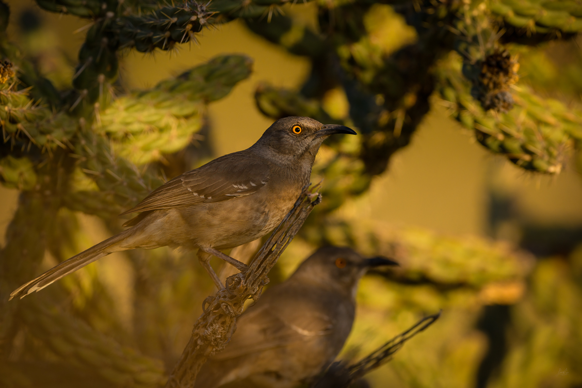
Is is too busy?

If you would like to post, you'll need to register. Note that if you have a BCG store account, you'll need a new, separate account here (we keep the two sites separate for security purposes).

grossidm

Well-known member
Marketplace
I say no. There is a fine line between environmental and busy and I don't feel I've crossed that line. If the bill encroached into that shadow I may have said otherwise. I think the eye is strong enough to keep the bg or second bird from distracting. What say you?
AP9_0685-Edit.jpg
You can only see EXIF info for this image if you are logged in.
 
Well done posting for critique, Daniel. Im afraid I find it far too busy and a bit unpleasant to keep looking at as a result, but my wife finds it a bit surreal (second bird contribution) and interesting!
I feel the environmental contribution shouldn’t detract from the focus on the main subject, and my wee brain got fair frazzled trying to stop wandering all round the image. Maybe just me 😊. I’ll be interested in others’ reactions.
Perhaps I just want this one to work? I've certainly done it before. Like you I'm interested in seeing what others think. Thanks
 
In a sense I like the background features etc. but there's too many highlights that will draw my eyes from the subject. And the second bird is bit like, when you see it you cannot unsee it.
If you are open to bit more editing, I would probably try to lower the bg exposure significantly and get rid of the other bird.
Thanks for your take on it. I won't do anything else to the image - I have a bunch of "good" images of this bird, I was just curious on what everyone thought on this particular shot.
 
I keep focusing on the overall greenish cast and sort of monochromatic low contrast vibe. I guess I'm wondering if the background is that color?
 
Something was in front of a part of the lens that rendered the body of the bird hazy and contrast-less. I could live with the busy environment around the bird, but then the entire bird had to be sharp like its head. This way does not work for me.
 
Back
Top