House Wrens - which view?

If you would like to post, you'll need to register. Note that if you have a BCG store account, you'll need a new, separate account here (we keep the two sites separate for security purposes).

M R Opp

Well-known member
Supporting Member
Marketplace
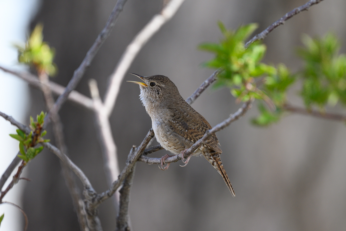
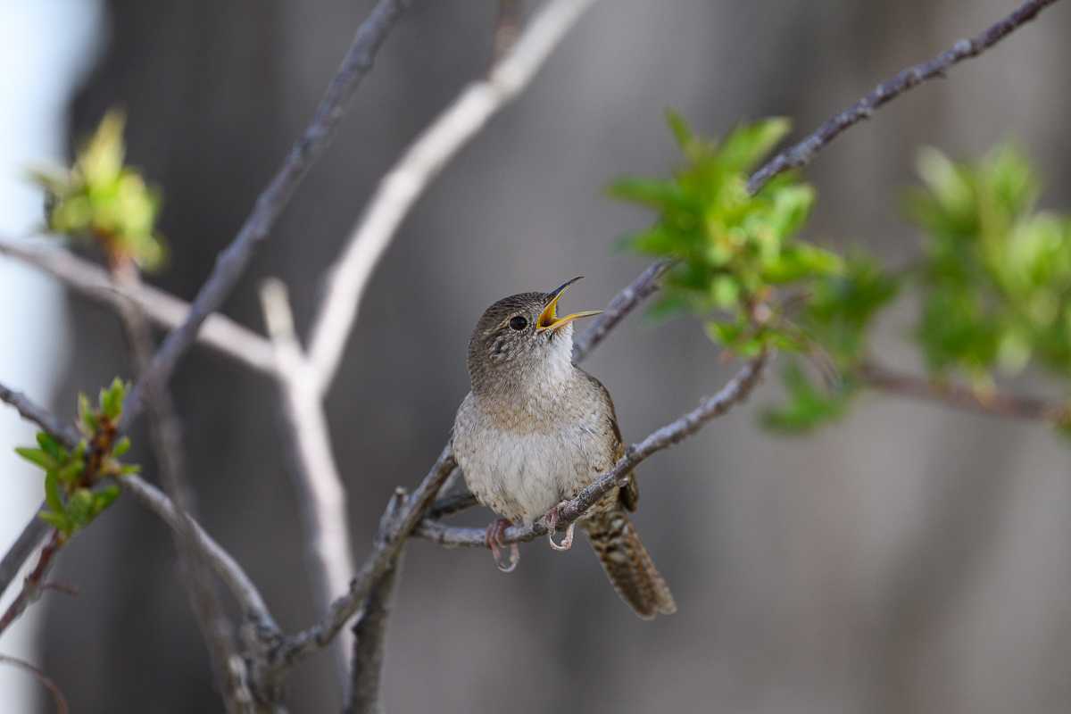
Before I start any post-processing, which view do you prefer? The wren facing away from the leaf (to its right; first image) or toward the leaf (its left; second image)? Any comments or suggestions for how I should approach post are welcome!
NZ9_9997.jpg
You can only see EXIF info for this image if you are logged in.
NZ9_9959.jpg
You can only see EXIF info for this image if you are logged in.
 
I agree with @DripDryMcFleye above. The first shot would be the better ID shot. The second shot is a better pose. In both shots I would get rid of the bright stick in the background. In the first shot it is pretty distracting being that close to the bird's face. The second shot it is not as distracting but still makes my eye look over there and not at the bird. At least the part of the stick that runs off to the right over the bird's head. I think that would be pretty easy to clone out.

Jeff
Thank you Jeff. I'll learn how to do the cloning. I'm sure that getting rid of that bright stick will help focus the eye on the wren.
 
I'd go with shot #2 for a couple of reasons. I like the head angle and eye connection to the viewer better in the second shot and you can probably eliminate the bright background stick or most of it with a careful crop in that second shot and the turn of the wren's head leaves decent distance along it's implied sight line.
 
I'd go with shot #2 for a couple of reasons. I like the head angle and eye connection to the viewer better in the second shot and you can probably eliminate the bright background stick or most of it with a careful crop in that second shot and the turn of the wren's head leaves decent distance along it's implied sight line.
Thank you for taking time to comment. I'm going to learn how to clone and remove that bright stick. Thanks again.
 
Back
Top