Cottonwood tree in White Sands NP

If you would like to post, you'll need to register. Note that if you have a BCG store account, you'll need a new, separate account here (we keep the two sites separate for security purposes).

RichF

Well-known and Infamous Member
Supporting Member
Marketplace
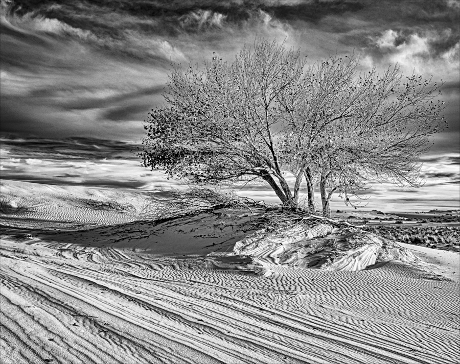
Two versions - which do you prefer (and why). Both have merit. I think the B&W is bolder, more powerful in away while the colored one is more subtle. Thoughts?
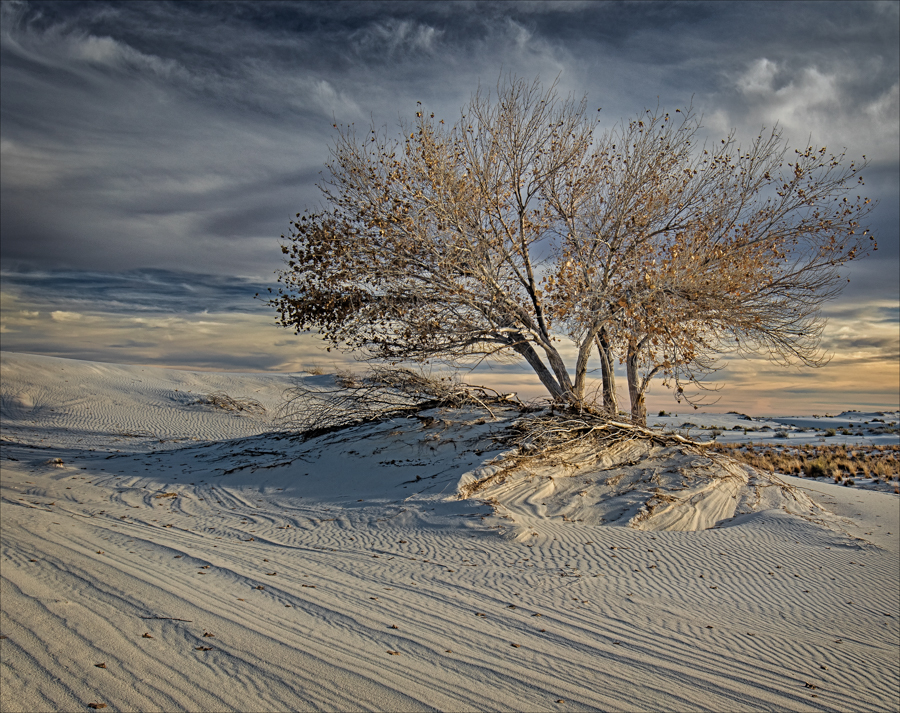
20151207_170547_White Sands_0317 12x16.jpg
You can only see EXIF info for this image if you are logged in.


20151207_170547_White Sands_0317 Large Mono.jpg
You can only see EXIF info for this image if you are logged in.
 
I think I prefer the first one. The values in the BW are similar for the tree and the background, where there is color contrast in the first one.
 
I like the black and white, but would dial back the contrast just a smidge. I like the boldness of that picture, as you said, but it I think it would look more natural and still quite dramatic with a little less contrast.

regardless both are great shots for different reasons. Well done.
 
I like the black and white, but would dial back the contrast just a smidge. I like the boldness of that picture, as you said, but it I think it would look more natural and still quite dramatic with a little less contrast.

regardless both are great shots for different reasons. Well done.
Appreciate your thoughts
 
Hands down, the B&W version is the stronger image to my eye. I think the B&W version has stronger visual appeal in the sky, offering more depth; not sure if you used an orange or red filter (simulation) in converting to B&W (to darken the skies)...if you did, it was effective and I would consider backing off to a yellow filter if you used orange or an orange filter if you used red, but I'm nitpicking. Nicely done either way.
 
both are good! Each radiates its own mood. The first one calming down. It clear that it is a desert where the rain is comming.
The second one brings more mystery. It can be even snow...
I like the first one becasue I know what it is and it kind of nostalgic. THe colour-pallette is very nice to look at like being colour-graded. I just like taht calming atmosphere.
 
I often like black and white landscapes, but in this case I prefer the color version. The tones are subtle enough that the color is not overpowering, but distinct enough to distinguish the white sands from the sky. In the black and white version the sand and sky blend together and it's hard for me to tell where one ends and the other begins.
 
Color is my first choice. The small area of yellow/orange tinted sky on the right side and the small area of golden tinted sand just at the base of the tree really enhance the photo for me. Great job with the clouds! The B&W is a bit too contrasty for my taste. Beautiful, artistic image.
 
Last edited:
Hands down, the B&W version is the stronger image to my eye. I think the B&W version has stronger visual appeal in the sky, offering more depth; not sure if you used an orange or red filter (simulation) in converting to B&W (to darken the skies)...if you did, it was effective and I would consider backing off to a yellow filter if you used orange or an orange filter if you used red, but I'm nitpicking. Nicely done either way.
Thanks. Appreciate the comments
 
both are good! Each radiates its own mood. The first one calming down. It clear that it is a desert where the rain is comming.
The second one brings more mystery. It can be even snow...
I like the first one becasue I know what it is and it kind of nostalgic. THe colour-pallette is very nice to look at like being colour-graded. I just like taht calming atmosphere.
Thanks Elena
 
I often like black and white landscapes, but in this case I prefer the color version. The tones are subtle enough that the color is not overpowering, but distinct enough to distinguish the white sands from the sky. In the black and white version the sand and sky blend together and it's hard for me to tell where one ends and the other begins.
That Foto Fool. Tough call between them.
 
I prefer the colored version of the two. The B&W seems to contrasty (don't think this is a word) on the left side of image and I find my eye traveling that way and find nothing there to reward it. On the colored version, I'm drawn in to the right side and you have the edge of the sunset. More pleasing to me IMHO.
 
I prefer the color version. I might prefer the B&W if the tree could be darkened and the clouds in the background brightened..

However, the lines in front of the tree are a problem for me - they look too much like a road and they lead my eye to nothingness on the left. So....I'd give it a 16x9 crop....then I think the composition would be much stronger.
 
Back
Top