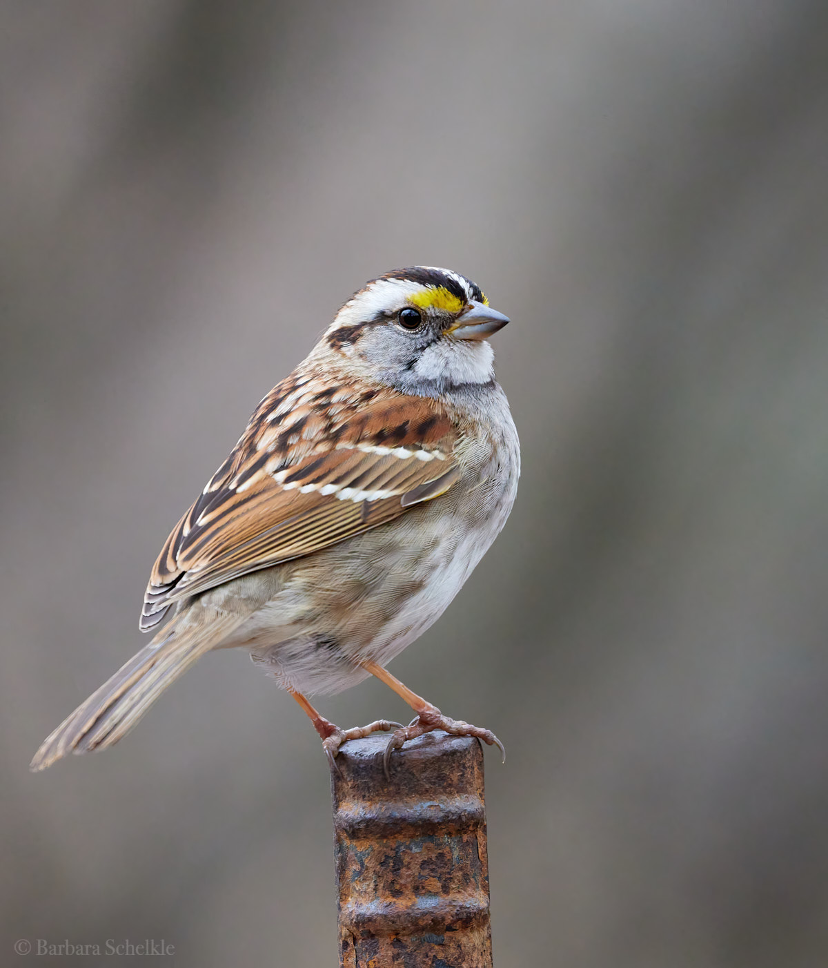
First post - which white throated sparrow do you like best?

If you would like to post, you'll need to register. Note that if you have a BCG store account, you'll need a new, separate account here (we keep the two sites separate for security purposes).

Hello,
I am new here and started bird photography as a hobby two years ago.
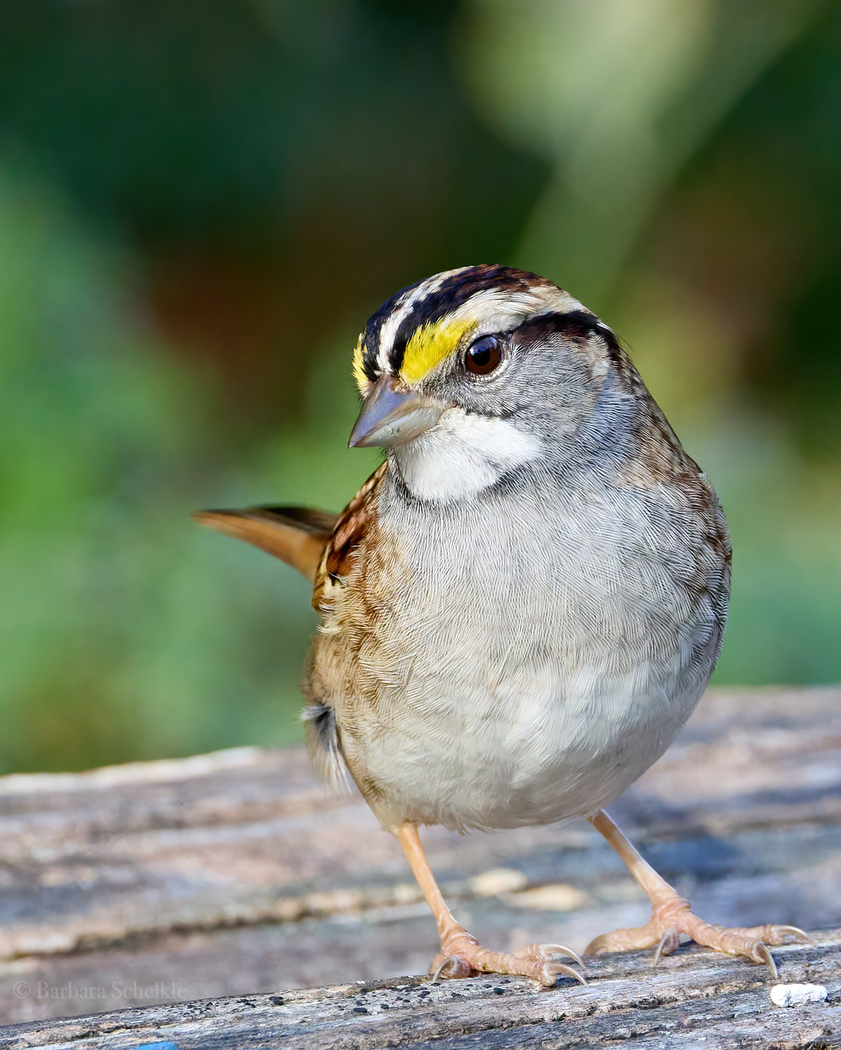
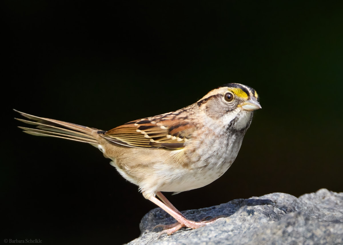
This seems to be a friendly group, so I'd like to share some images and get your critical feedback on these three sparrows. Not the same bird and shot at different times and locations (but all in Brooklyn, NY). I like all three for different reasons, but curious to hear what you think and what I can learn.
(I hope I manage to post the images correctly, I already had to scale them down considerably to meet the file size requirements...)
1R7_3720_BCG.jpg
You can only see EXIF info for this image if you are logged in.

1R7_7506_BCG.jpg
You can only see EXIF info for this image if you are logged in.

IMG_7048_BCG.jpg
You can only see EXIF info for this image if you are logged in.
 
Hi Barbara

First of all, welcome to the forum. That' a great set of images there. If I really had to pick one, I'd probably go with the first one. The pose of the bird and the visible feather detail really appeal to me.

As far as constructive criticism goes, the only thing that comes to mind (and it's minor as well); try to play a bit with cropping less tightly (assuming these are crops). Giving the subject/bird a bit more room in the frame can often be beneficial to the overall look of an image.

Looking forward to seeing more of your work.
 
Hello,
I am new here and started bird photography as a hobby two years ago.
This seems to be a friendly group, so I'd like to share some images and get your critical feedback on these three sparrows. Not the same bird and shot at different times and locations (but all in Brooklyn, NY). I like all three for different reasons, but curious to hear what you think and what I can learn.
(I hope I manage to post the images correctly, I already had to scale them down considerably to meet the file size requirements...)
View attachment 58950
View attachment 58951
View attachment 58952
There all great but I like the first one the best.👍👍👍
 
Welcome to the forum and hope you enjoy your time here.
Like Ralph and Jochen said above, I like all of them. Number 1 and number 3 appeal to me most for different reasons. I like the exposure and clarity of number 1. I like the muted colors of the background on number 3. Number 2 either the focus missed just a little or the bird's head moved during the exposure. There is just a hint of motion blur or missed focus in that image. However, with that said, it is still a nice shot.

Suggestions:
in photo 1, I would clone out or darken the hot spot of bright green over the bird's head. When most of the background is dark a bright spot draws the eye and detracts from the beautiful subject. It would be fairly easy to remove in post processing.
Photo 2 like I said above, it is just a touch soft. However, I like the pose and the lighting.
Photo 3 appeals to my eye. Something about the bird sitting on a rusted piece of rebar with the muted brown background is peaceful.

I agree with Jochen that maybe opening up the crop just a little to give the bird some "room to breathe" in the images may be good but without seeing the uncroped images it is hard to say for sure.

Overall, these are good shots, white throated sparrows are beautiful subjects and you captured their personality in these photos.

Jeff
 
WELCOME to BCG! Glad you joined us!

The members above have given you some good advice. Of the 3 images, I prefer #3. The perch and background complement the subject without taking attention away from the subject. The exposure seems excellent and the eye and head are nice and sharp. #1 seems a bit over-exposed. In #2, the eye/head are not quite in focus. I agree with Jochen that you might try cropping a bit looser. Check out some of the other wildlife threads for some great examples of how others position their subject within the frame.
 
Hi Barbara, I think they are nicely done. You kept the highlights bright without blowing any out and the texture in the feathers comes through nicely. The black background doesn't appeal to me, but that is just personal preference. For the first one, I like parts of the creamy background and myself I would use some of the part on the middle upper right to extend into the area around the head, kind of framing the head with a creamy halo and removing the distracting stick or whatever coming out of the head. Again only one opinion.

I agree with more room for the tail on the bottom one. If you don't have it in the original uncropped image it's an easy Photoshop fix to use content aware fill since it is uniform in color.
 
Last edited:
Thanks again everyone for the very helpful feedback!

Most of you suggested to losen the crop, this is great advice. I think there are reasons why I often crop too tight:
  1. I am getting too excited about the feather details that these sharp lenses provide and that "close look" that one normally doesn't get in real life
  2. Sometimes (as in the first image), I crop to get rid of distracting elements. I have only recently learned how to clone out such elements in post processing and I am still not very good at it (I use affinity photo). Lots to learn...
Below are two slightly different crops of the first and third image:
1R7_3720 1_BCG-DeNoiseAI.jpeg
You can only see EXIF info for this image if you are logged in.

IMG_7048_BCG-DeNoiseAI.jpeg
You can only see EXIF info for this image if you are logged in.


Most of you preferred the first image, there is obviously more engagement in the pose. But I found it really interesting that some of you preferred the third, which is also one of my favorites, because of the overall color impression and that rusty perch. I think Jeff and Karen said that better than I could have. Thank you!

And only thanks to your exquisite eyes did I now notice that #2 is indeed not sharp. What I liked about that is how the bird stands out against the black background, but I do like it least of the three.

Overall grateful for all your comments and encouragement!!!
 
Thanks again everyone for the very helpful feedback!

Most of you suggested to losen the crop, this is great advice. I think there are reasons why I often crop too tight:
  1. I am getting too excited about the feather details that these sharp lenses provide and that "close look" that one normally doesn't get in real life
  2. Sometimes (as in the first image), I crop to get rid of distracting elements. I have only recently learned how to clone out such elements in post processing and I am still not very good at it (I use affinity photo). Lots to learn...
Below are two slightly different crops of the first and third image:
View attachment 58983
View attachment 58984

Most of you preferred the first image, there is obviously more engagement in the pose. But I found it really interesting that some of you preferred the third, which is also one of my favorites, because of the overall color impression and that rusty perch. I think Jeff and Karen said that better than I could have. Thank you!

And only thanks to your exquisite eyes did I now notice that #2 is indeed not sharp. What I liked about that is how the bird stands out against the black background, but I do like it least of the three.

Overall grateful for all your comments and encouragement!!!

I think that's a good result.
 
Hello and welcome to BCG. Personally I prefer the bird perched on the rebar (#3), the first two look somewhat overexposed but it might just be my computer. Having shot Canons for a number of years during which I really liked Canon colors, the photos out of the camera always looked somewhat overexposed and under-saturated unless I corrected them in post-processing. But we all see colors differently.
 
Back
Top