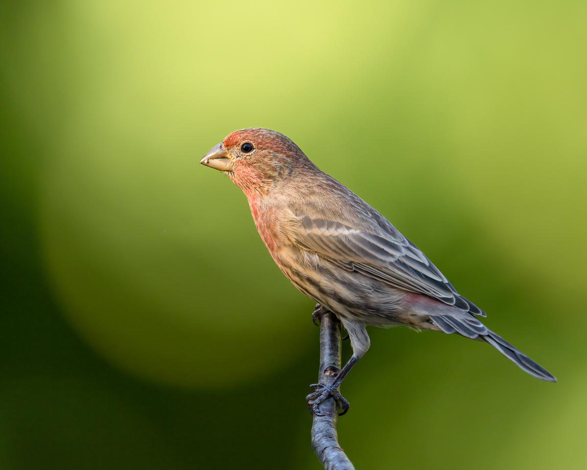
House Finch

If you would like to post, you'll need to register. Note that if you have a BCG store account, you'll need a new, separate account here (we keep the two sites separate for security purposes).

dupcak

Well-known member
Supporting Member
Marketplace
Finally getting up the nerve to post some more images from the fall. This is another bird-on-a-stick image as I try to improve my small songbird skills. I'd appreciate critique (much preferred over praise :) ) Question: does the left over "snack" on the bill detract from the image?

_RD43770-Edit.jpg
You can only see EXIF info for this image if you are logged in.
 
This is a very nice shot! The lighting is really sweet, as is the composition, sharpness, and details. My few small suggestions are to add a little more contrast into the bird, have the bird looking slightly more toward the camera, and leave a little more space on the left side of the frame for the bird to look into. The background is confusing me, I can’t decide whether I like it or not. It’s not that I don’t like the green, it’s because most of it is that light green, but then the bottom is much darker. What I’d suggest is for you to pick which shade of green you like better. If you like the dark green better, I’d suggest darkening down the light green area a decent amount. If you like the light green, maybe bring up the shadows a decent amount in the dark section.

Question: does the left over "snack" on the bill detract from the image?
It’s a personal preference, to be honest. For me, I don’t mind it, but I’m sure others will.
 
This is a very nice shot! The lighting is really sweet, as is the composition, sharpness, and details. My few small suggestions are to add a little more contrast into the bird, have the bird looking slightly more toward the camera, and leave a little more space on the left side of the frame for the bird to look into. The background is confusing me, I can’t decide whether I like it or not. It’s not that I don’t like the green, it’s because most of it is that light green, but then the bottom is much darker. What I’d suggest is for you to pick which shade of green you like better. If you like the dark green better, I’d suggest darkening down the light green area a decent amount. If you like the light green, maybe bring up the shadows a decent amount in the dark section.


It’s a personal preference, to be honest. For me, I don’t mind it, but I’m sure others will.
Thanks for the feedback - much appreciated! I too had thought about more room on the left, but with this aspect ratio I thought it would give a bit too much room on the top - easily fixed with a different AR since I do have more room in the original. As far as contrast - great suggestion! I tend not to play around with contrast for some reason, I'm not that comfortable with it yet I guess. Interesting ideas around the background - I hadn't thought about the tonality of the greens. I liked the shape and softness of the OOF areas, but didn't really think about their relative shades - I'll have to play around with that.
 
For me the little snack is no issue, some purists will disagree. A little more space for the bird to look into might improve the image (if I'm nit picking), but sometimes we just have to use what nature provides us. I know some folks will use PS to extend the image bg and provide additional space - to me that seems a bit like creating a composite image and should not be passed off as a natural image.

All in all this is a very nice image and you should not be hesitant to post more.
I appreciate the thoughts, I do have more room on the left in the original so I can definitely give more room without creating something fake. It was something I was already thinking about so the confirmation is welcome.
 
For what it's worth; my eye is always drawn to the brightest spot of an image...the hot spots if you will; I would selectively darken the bright green in the background just a bit. I agree with the comment about giving a little more space to look into; personally, I would probably remove the remnants of the snack as well. All of this is, of course subjective...it's a nice image of a small songbird!
 
For what it's worth; my eye is always drawn to the brightest spot of an image...the hot spots if you will; I would selectively darken the bright green in the background just a bit. I agree with the comment about giving a little more space to look into; personally, I would probably remove the remnants of the snack as well. All of this is, of course subjective...it's a nice image of a small songbird!
Thanks for bringing up the topic of bright areas. I've also found my eye being drawn to the brightest portion of various images, but then I've seen plenty of great images from Jan Wegener that are definitely bright backgrounds (and he is a big proponent of them in his videos). So I've been confused between these two concepts that are seemingly at odds with each other. (Bright background vs eye being drawn to bright objects). Maybe it works for Jan because his backgrounds are usually very smooth.

Of course my photo has a mix of brighter and darker areas which @BAL Land mentioned can be a bit distracting so I'll spend some time evening things out when I get a chance.
 
Birds land on sticks, so I have zero issues with that. I probably would take out the bit of seed, but it is what is…and it’s a personal choice. I would probably “select subject” mask in Lightroom and then invert and bring down the background expose a bit and see if I liked it…or not. If you are ok with editing, I like to put the light on the subject. It’s is all a matter of personal choice.

All in all….it’s a great shot!
Thanks - I think I actually brightened the background (going for more of the Jan Wegener look), but I'll give the opposite a try and also try smoothing out the various shades of green in the background. It's all just pixels (and time) :cool:
 
Second attempt: added more room to the left, bumped up the contrast and tried to even out the shades of the background - not overly successful with that last one, but things are a bit more compressed (in terms of tonal range). Improvement or not?


_RD43770-Edit-2.jpg
You can only see EXIF info for this image if you are logged in.
 
And a second attempt at compressing the tonal range of the background. I personally like this one better, but I can understand the concept of bright objects draw your eye away. So in the end I'm a bit torn, but it's a good learning experience.
_RD43770-Edit-3.jpg
You can only see EXIF info for this image if you are logged in.
 
And a second attempt at compressing the tonal range of the background. I personally like this one better, but I can understand the concept of bright objects draw your eye away. So in the end I'm a bit torn, but it's a good learning experience.
This last version is better. I might be tempted to reduce the highlights even a bit more. That way the bird shows more prominently while competing less with the background.

Ultimately, though, it's a matter of personal taste. A very well captured image, regardless.


_RD43770-Edit-4.jpg
You can only see EXIF info for this image if you are logged in.
 
This last version is better. I might be tempted to reduce the highlights even a bit more. That way the bird shows more prominently while competing less with the background.

Ultimately, though, it's a matter of personal taste. A very well captured image, regardless.


View attachment 50143
Thanks - I see what you're meaning by brining down the highlights - makes sense to me.
 
Back
Top