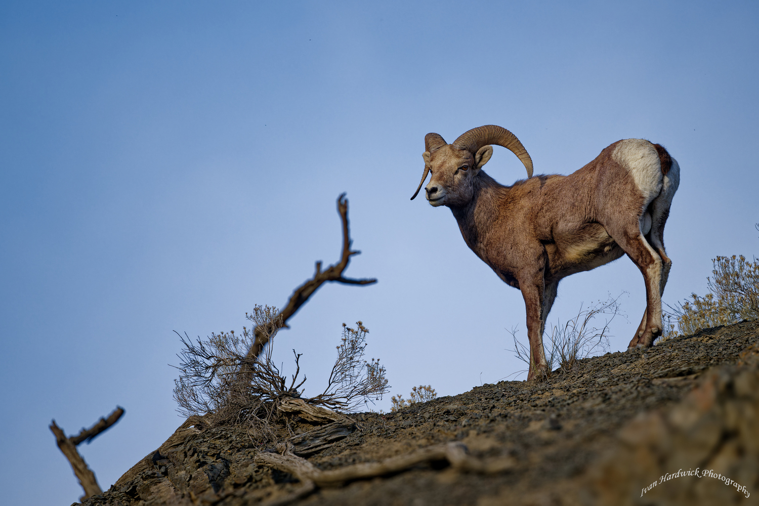
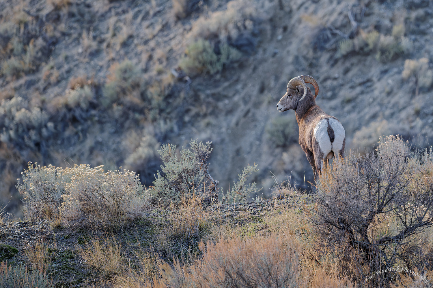
I'm very proud of these two shots!

If you would like to post, you'll need to register. Note that if you have a BCG store account, you'll need a new, separate account here (we keep the two sites separate for security purposes).

BCcanuck

Well-known member
Marketplace
Is my pride misplaced?
BCG 4.jpg
You can only see EXIF info for this image if you are logged in.


BCG 5.jpg
You can only see EXIF info for this image if you are logged in.
 
Not at all, IMO. The second is dramatic in its own right, and I really like the separation between foreground and background in the first. If I had any suggestion at all, I'd fix the fringing in the second shot. But if they were mine I'd be proud too.
 
You should be happy with them. The fist would have been even better if you could have moved a couple of feet to the left so the ram's rear legs weren't hidden by the shrub, but that may not have been an option.
 
Bighorn are great subjects. I like how you placed the first one off center with space in the direction it is looking. The second is good also, but a plain blue sky backdrop is difficult make work well.
 
You should be ! Beautiful photeaux! :love:My only nit to suggest would be a crop from the extreme left sides of each , lose the far left branch in #2, but keep the Sagebrush in #1, what's there doesn't seem to add significantly to either one.
 
Last edited:
Their not bad shots but they are not great either.
In the first one the pose of the subject doesn't work (animals turning away from the viewer need a bit more context and that is lacking there) and in the second one the angle you were shooting make the shot feel snapshot-ish.

If they were my first bighorn shots, I'd be more than happy with them but I would also work on getting better shots.
 
You should be, both are great shots. As suggested above, the second photo has the put the sheep in an elevated perch. Why not crop it to bring it lower (leaving more sky room of course) removing more of the foreground and the same goes with the first photo.
 
I'm a hack photographer new to this forum so please take my critique with a grain of salt.

Great captures but I would have liked to see just a bit more environment with both of the shots to give some context and maybe lessen the distractions (make them smaller in the overall frame). I feel like that second shot would be amazing if I knew/could see more without the subject being up so close. Feels too zoomed in (I'll use StefanSC's word, too snapshot-ish). As I look at the picture, I'm asking myself if there's a small plateau below that he/she is overlooking? Another animal it's watching? Or maybe he's the leader of the heard overlooking his flock?

I'm all for the mystery of what's outside of the shot to elicit the imagination but these seem a bit close.

Ultimately, you are the artist that snapped and framed the shots to convey something. Who the #%@% am I to criticize a shot that took you hours/days/weeks to capture? I will at some point post pictures here for critique, so you'll have a chance to exact your revenge :)
 
I find the first picture to be the better of the 2. The context issue doesn't bother me since it requires some imagination on the viewer's part. I think there needs to be more contrast between the subject and the background. I don't like the stick in the 2nd picture. Perhaps a tighter crop would help. I really like the potential in the first picture.
 
Back
Top