Bob k.
Active member
I shot the following images a week or two ago in Joshua Tree and I processed them in LR ( I did use PS to remove some things like air plane trails). They are both single images, 3200 iso at f2.0 and I used the LR Denoise tool. The pictures were shot with only ambient light. I love shooting the Milky Way but I am not real confident in my post processing. I have included some of my thoughts on each shot and I would appreciate your feedback and suggestions to help me improve.
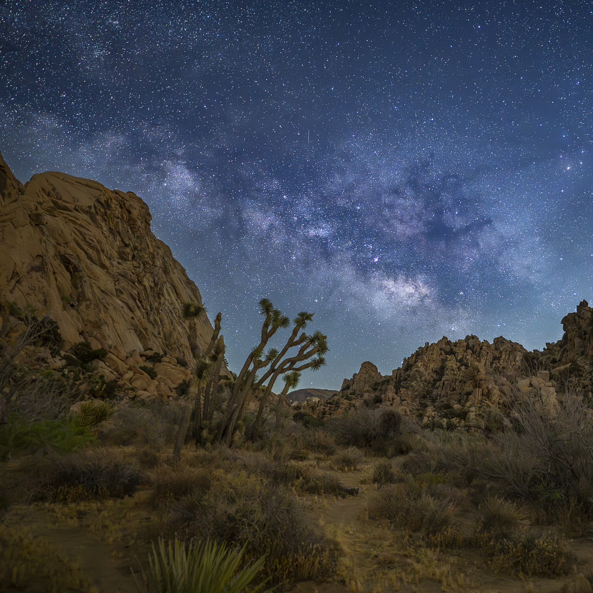
Number 1 was shot just after the moon set around 10:30 with an exposure of 10 seconds. With this image I wanted to get the galactic core rising between the two rock ridges so the ridges would frame it. I also like the way the Joshua Trees seem to reach up the the GC. I pushed the blue and magenta more than I typically do to give it more color and punch to the image.

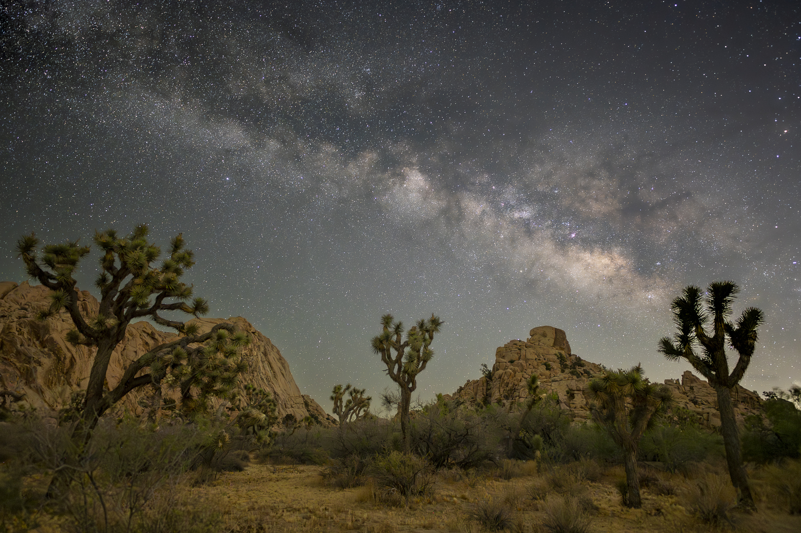
Number 2 was shot later in the evening when the Milky Way was higher in the sky with an exposure of 15 seconds. With this shot, since the MW was higher in the sky we pulled back to get it arching over the rock formations and we also were able to include some of the larger Joshua trees in the shot. I think the trees in the mid ground and rock ridges in the back ground give the shot some balance. I left the sky a more neutral color on this one.

Number 1 was shot just after the moon set around 10:30 with an exposure of 10 seconds. With this image I wanted to get the galactic core rising between the two rock ridges so the ridges would frame it. I also like the way the Joshua Trees seem to reach up the the GC. I pushed the blue and magenta more than I typically do to give it more color and punch to the image.
You can only see EXIF info for this image if you are logged in.
Number 2 was shot later in the evening when the Milky Way was higher in the sky with an exposure of 15 seconds. With this shot, since the MW was higher in the sky we pulled back to get it arching over the rock formations and we also were able to include some of the larger Joshua trees in the shot. I think the trees in the mid ground and rock ridges in the back ground give the shot some balance. I left the sky a more neutral color on this one.
You can only see EXIF info for this image if you are logged in.

