Pheasant - Which photo is better and why

If you would like to post, you'll need to register. Note that if you have a BCG store account, you'll need a new, separate account here (we keep the two sites separate for security purposes).

Tiago C

Well-known member
Supporting Member
Marketplace
Hi,

From the selection of photos below, could you please let me know which you would/would not pick as the best and why? What could be improved?
I have an idea of problems with some images but I would like to know your thoughts.

Thanks,
Tiago

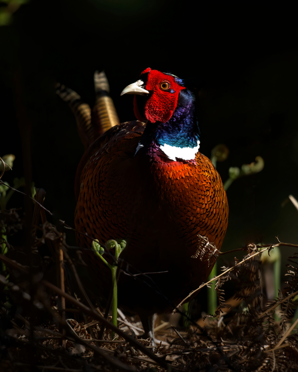
1:
CHA04365-denoise-standard_small.jpg
You can only see EXIF info for this image if you are logged in.

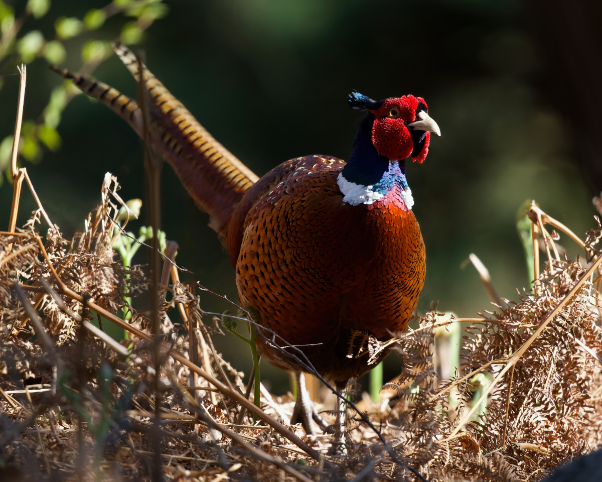
2:
CHA04390-denoise-clear_small.jpg
You can only see EXIF info for this image if you are logged in.

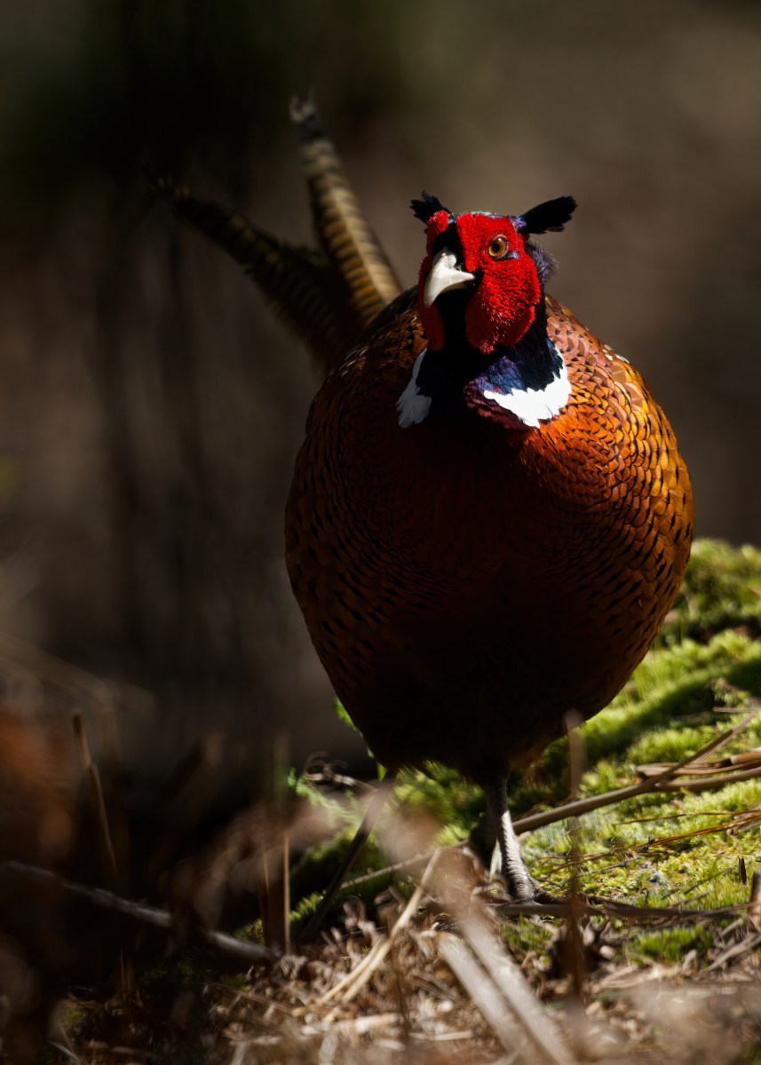
3:
CHA04399-denoise-standard_small.jpg
You can only see EXIF info for this image if you are logged in.

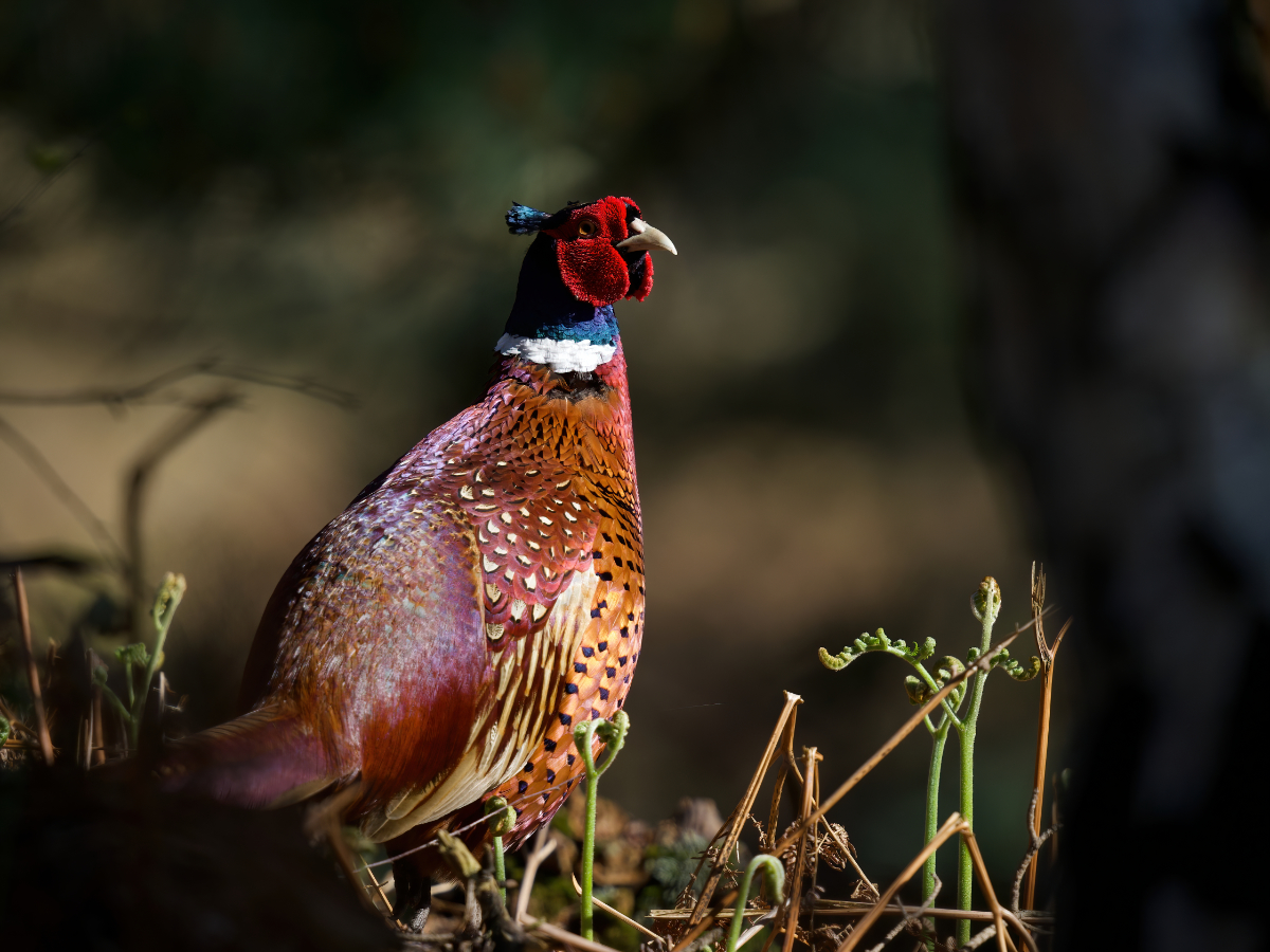
4:
CHA04572-denoise-clear_small.jpg
You can only see EXIF info for this image if you are logged in.
 
Personally like the third one best because elf the pose(more side angle with eye contact), and the surrounding elements( not the bird) aren’t as distancing. However, all of the shots look underexposed and too contrasty. Also, the whites on the neck ring are too bright, or blown out.
 
I agree with @BAL Land - the third seems the best to me because of seeing the entire bird. #1 is nice as it shows off the colorful markings on the wings but I'm missing the tail. I also agree that the shadows can be pulled up. Admittedly the darker shadows give it a more "moody" look of being in the dappled light of a forest, but to my eye you end up missing a lot of the details that make this bird beautiful
 
Photography is all about light. The direction of light, the temperature of light, etc. The human eye goes to the brightest part of an image. Folks gravitate to #3 because the bird is better illuminated and allows the viewer to see all the colors and patterns in the feathers.

Using the edited image in Post #3 as a guide, see if you can improve on image #1. You would have to bring down the brights a bit on the back of the bird, but open up/lighten the head and surrounding vegetation.
 
Hi,

From the selection of photos below, could you please let me know which you would/would not pick as the best and why? What could be improved?
I have an idea of problems with some images but I would like to know your thoughts.

Thanks,
Tiago

1:
View attachment 58600
2:
View attachment 58601
3:
View attachment 58602
4:
View attachment 58603
It would be the 2nd & 3rd shots for me.
I like the 3rd shot for the foreground & background colours giving you a sense of the Pheasants habitat, but also like the 2nd shot with the dark background which really brings out the birds colours.
Nice shots young sir 👏👏
 
Back
Top