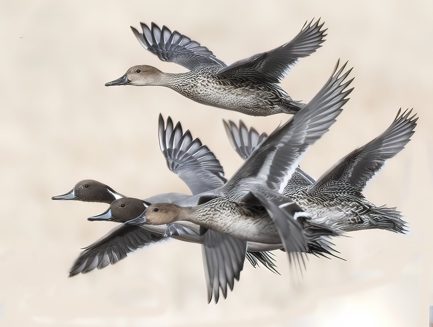
Pintails Pass in Review

If you would like to post, you'll need to register. Note that if you have a BCG store account, you'll need a new, separate account here (we keep the two sites separate for security purposes).

Pintails at Bosque
DSC_8679 copy.jpg
You can only see EXIF info for this image if you are logged in.
DSC_8679 copy.jpg
You can only see EXIF info for this image if you are logged in.
del Apache
 
amazing image! it can be an engraving or a pencil work. very nice!
The only problem is that the most close to phototgrapher bird (where they are three) is not so sharp as the others. It looks a bit unsharp - the head and the neck. Perhaps, you try to sharp it with high-pass filter and contrast to get it the same sharpness as the others?
 
It's a wonderful composition...I'm struck by the processing...it looks more like a very detailed pencil drawing with a watercolor wash/sepia toning than a photograph in some ways (not that that is a bad thing!). Could you comment on your approach in processing? I'm curious...
 
It's a wonderful composition...I'm struck by the processing...it looks more like a very detailed pencil drawing with a watercolor wash/sepia toning than a photograph in some ways (not that that is a bad thing!). Could you comment on your approach in processing? I'm curious...

I'm with Coach, very curious as to how you obtained this look. Very unique.

Over sharpening I suspect is one type of processing used to obtain that sort of look , you can definitely notice the loss of feather detail in some of the wings..


Harry.G
 
Thank you for your comments. The photo was a crop from a large group of ducks taking off when a coyote approached. The flock flushed and I was about 60 yards away Nikon D500 , Nikon 400 mm Prime lens. I really did not do anything "fancy" to the photo - you can see where one of the wings on the left is a bit blurred due to a less than stellar selection. After selections were made I did slight color corrections - and then Topaz denoise . The selected photo was a burst of about 10 shots and all of them reflect the same color and tonality. I recall the light was excellent and everything came together
 
Since you asked for critique there are two things I notice. One is the composition in my view would be stronger without the upper bird. Just the 3 stacked up is a nice clean look and a strong composition. The other could be easily removed. Just my view, others will disagree.

Second is the poor selection where the halos are evident. Sometimes the refine selection tools in Photoshop help. Other times just magnify and plenty of hand work with the brush.

A nice look though, the clean lines and painterly look works.
 
Beautiful image, The only minor critique I could offer, is that you could of given a little more space in the front of the ducks. It's a great shot (y)
 
Back
Top