You can only see EXIF info for this image if you are logged in.
You are using an out of date browser. It may not display this or other websites correctly.
You should upgrade or use an alternative browser.
You should upgrade or use an alternative browser.
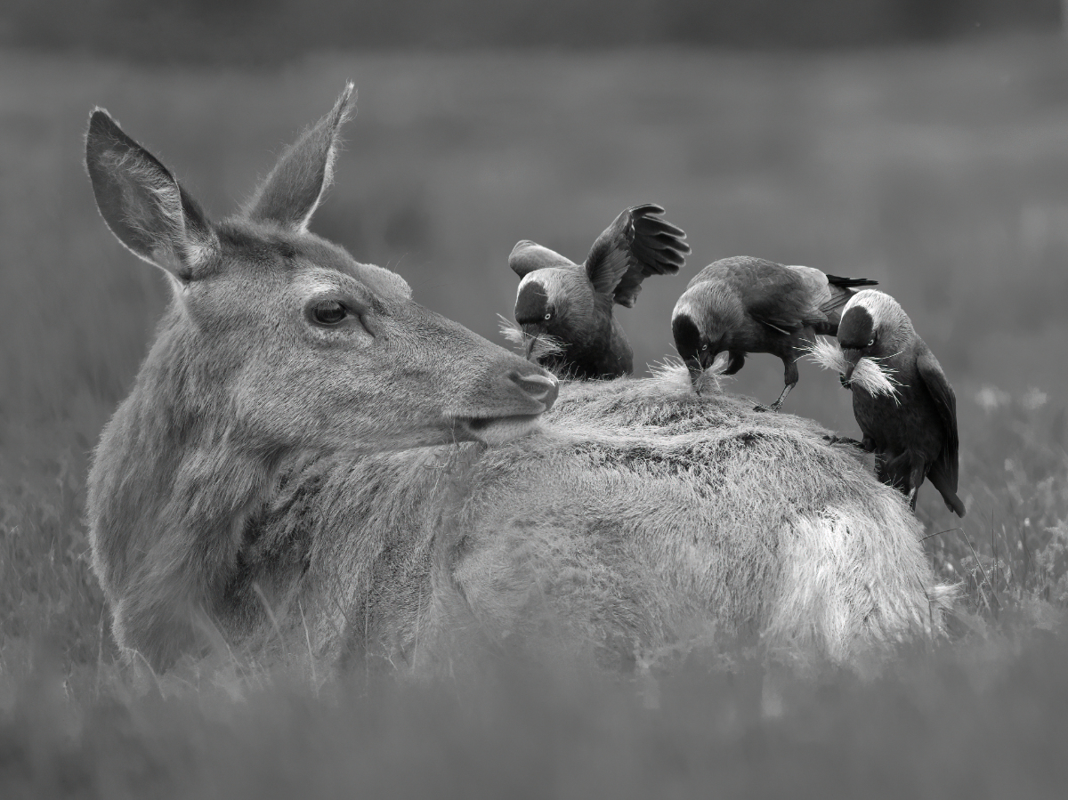
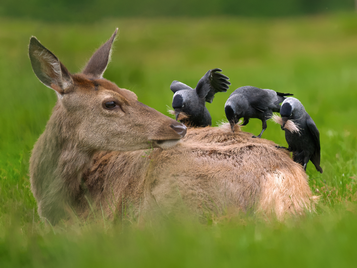
Thoughts on this edit?
- Thread starter Tiago C
- Start date
If you would like to post, you'll need to register. Note that if you have a BCG store account, you'll need a new, separate account here (we keep the two sites separate for security purposes).
raptor photo
Well-known member
I'd like to see a color version before choosing, but great shot!
I'd like to see a color version before choosing, but great shot!
Thanks. Here's my original edit:
You can only see EXIF info for this image if you are logged in.
It tells a nice story of the behavior of the birds being casually allowed to gather materials. I don't think the the black and white enhances it, but in the color version I think the saturation in the grass is too high. In both I wish there was more room for the head, and I wish the blacks of the birds had some detail. Looking into the featureless clipped blacks to me is distracting. Maybe there is some room in the raw file to raise the blacks selectively?
Woody Meristem
Well-known member
Great shot. I too would like more empty space on the left side of the image. Think about cloning out the bird feathers under the deer's ear, they're rather distracting. Personally, I think the color version is the better of the two.
Great suggestions, thank you
Neat image. I agree with the others that the image seems cramped and if this is a crop I'd open it up a bit.
Did you add additional background blur in post or is that just the way the background was rendered due to DoF?
Did you add additional background blur in post or is that just the way the background was rendered due to DoF?
Warren D
Well-known member
I'd add that you should clone out the piece of wing coming out from the left side of the head. I think I prefer the B&W, but maybe add some mid-range contrast.
I like the edit from a composition standpoint. As cropped the balance between the three birds and the deer? looks nice. It's a nice image with interesting subject matter.
I'd try to provide a little more "pop" to the subjects - deer and birds. Maybe a little more clarity and/or contrast to pull the eye into the shot. In the conversion to B&W you could also lower luminance on the green channel to darken the background and increase separation.
There is also a wing tip behind the ear of the deer that needs to be cloned out. It's distracting.
raptor photo
Well-known member
Definitely more room around the subject. I prefer the color version. I don't think the wingtip is distracting.
I agree with Eric's comments.....and suggest a slight de-saturation and darkening of the greens, which form a natural vignette around the subjects.
Neat image. I agree with the others that the image seems cramped and if this is a crop I'd open it up a bit.
Did you add additional background blur in post or is that just the way the background was rendered due to DoF?
Thank you. No I didn't add background blur in post.
I like the edit from a composition standpoint. As cropped the balance between the three birds and the deer? looks nice. It's a nice image with interesting subject matter.
I'd try to provide a little more "pop" to the subjects - deer and birds. Maybe a little more clarity and/or contrast to pull the eye into the shot. In the conversion to B&W you could also lower luminance on the green channel to darken the background and increase separation.
There is also a wing tip behind the ear of the deer that needs to be cloned out. It's distracting.
Thank you. Original uneditied image below. My original framing was meant to help with catching the birds taking off and unfortunately I didn't leave much space to the left of the deer.
With some creativity (or generative fill) I might get some extra negative space to the left. As you mentioned, I tried to strike a balance between the deer and the birds - and cropped quite tight to make the birds stand out. However, I completely understand others' feedback about the lack of negative space so I'll see if I can improve that.
"In the conversion to B&W you could also lower luminance on the green channel to darken the background and increase separation." I'm not used to B&W edits but did that exactly. I will see if I can push the luminance beyond its limit or find some other method to darken the green a bit further so that the subjects stand out more.
I will also try to clone out the wing on the LHS of the frame.
You can only see EXIF info for this image if you are logged in.
Last edited:
tclune
Well-known member
I really like the color version and completely disagree with others about cloning out the wing. I didn't notice it in B&W, which is part of my preference for the color version. The wing just adds to the sense of the deer being blase while being swarmed by birds intent on "feathering" their nests.I'd add that you should clone out the piece of wing coming out from the left side of the head. I think I prefer the B&W, but maybe add some mid-range contrast.
Here are the images after re-editing.


You can only see EXIF info for this image if you are logged in.
You can only see EXIF info for this image if you are logged in.
tclune
Well-known member
On seeing your edit with the bird wing removed, I'm even more convinced that you should keep the wing. To my eye, the photo looks out of balance -- the birds "weigh down" the right side of the photo, while when the wing is there, your attention is split more evenly between the birds and the deer. The rest of the color edits in the new version strike me as very good. FWIW
Marcelo_R
Active member
Tiago, I like A LOT the new B&W version, soft, non-agressive, as the whole idea (to my eyes) behind the interaction of the peckers and the deer, peacefully working on its skin.
Thanks for sharing it!
Krgds, Marcelo
raptor photo
Well-known member
So much better, both of them!
I always strive to capture images of animals doing something interesting. You nailed it with this shot. I thought the wing may be cloned out but after seeing it the wing behind deer’s head seems natural. Nature can be messy. This is a very interesting photo
It is an awesome photo! I think you received great sugestions and the final edits make it even better. I’m in the take out the feathers behind the ear camp. I like the B&W a little more.
If you had the entire bird, I could see that benefit as being possible. But small cutoffs and overlaps like that wing are a well known problem. Regardless of the benefit to balance, it's something that needs to be fixed. When you look at the photo the question becomes, "What is that sticking out of the ear?" That's a clear sign of a distraction. If balance is the concern, there are other ways to address that issue.On seeing your edit with the bird wing removed, I'm even more convinced that you should keep the wing. To my eye, the photo looks out of balance -- the birds "weigh down" the right side of the photo, while when the wing is there, your attention is split more evenly between the birds and the deer. The rest of the color edits in the new version strike me as very good. FWIW
I don't want to start a debate over the issue - just to provide a professional perspective as well as the perspective of a judge in a lot of competitions.
raptor photo
Well-known member
A lot of competitions though wouldn't allow the wing to be removed. I agree it's better off without the wing but not enough to make it worth editing out.If you had the entire bird, I could see that benefit as being possible. But small cutoffs and overlaps like that wing are a well known problem. Regardless of the benefit to balance, it's something that needs to be fixed. When you look at the photo the question becomes, "What is that sticking out of the ear?" That's a clear sign of a distraction. If balance is the concern, there are other ways to address that issue.
I don't want to start a debate over the issue - just to provide a professional perspective as well as the perspective of a judge in a lot of competitions.
jfredrick
Well-known member
Excellent processing and edits on the color rework! Wonderful image. Congrats! 
Woody Meristem
Well-known member
To me the edited version is much superior; the crop is good and that disembodied wing is gone  . The feathers sticking out behind the wing were no different than if they were stinking in at the edge of the frame. Your edit might be inadmissible in a contest, but this isn't a contest and to me most contests aren't worth the time since so much of the judging is dependent on someone's whims.
Love the edit! B/W puts green background way into the background so focus is on what's happening. Color brings green forward to draw attention away from tthe key story.

