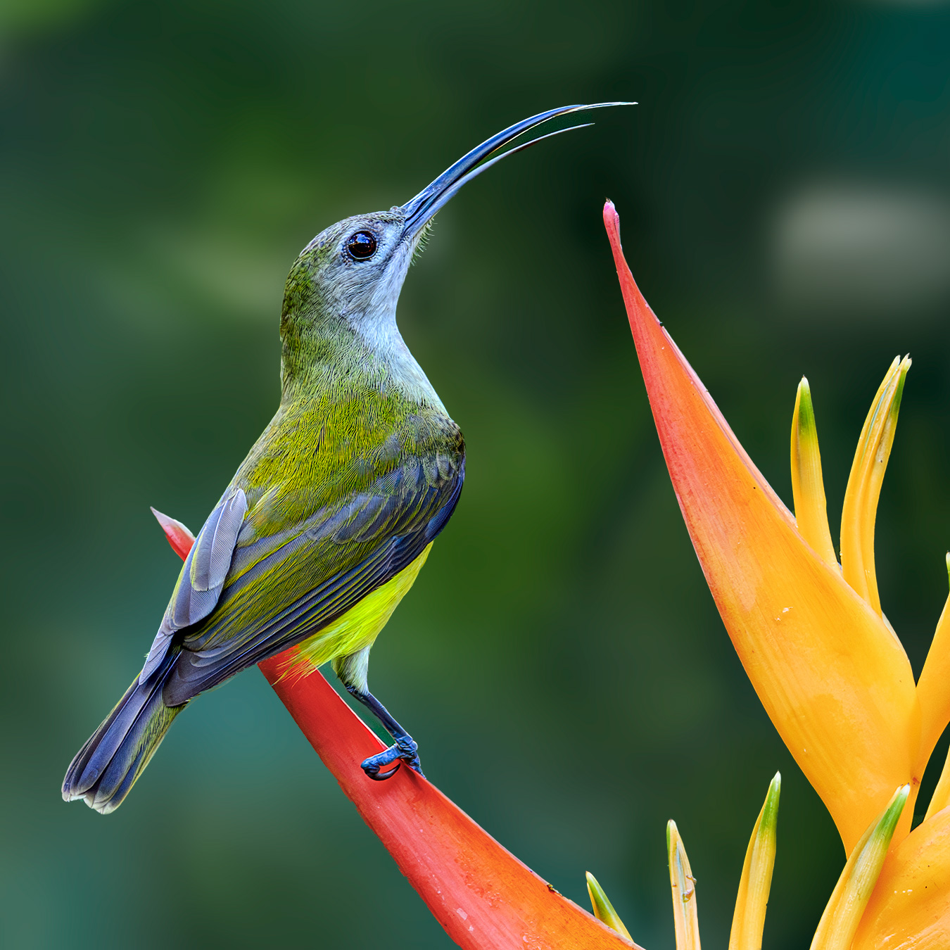
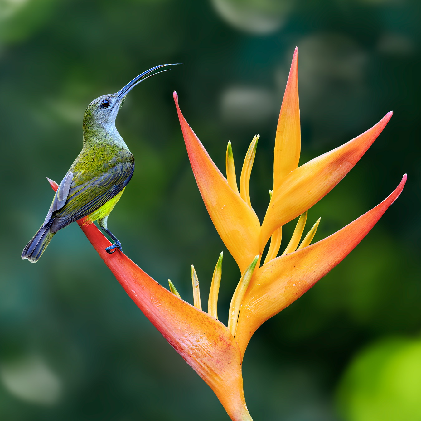
Which do you prefer ? (another one)

If you would like to post, you'll need to register. Note that if you have a BCG store account, you'll need a new, separate account here (we keep the two sites separate for security purposes).

The close crop
NZ8_2288-1350x1350x300-BGB.jpg
You can only see EXIF info for this image if you are logged in.


or

The wider crop?

NZ8_2288-1350x1350x300-BGB-LC.jpg
You can only see EXIF info for this image if you are logged in.


Little spider hunter (from the sunbird family)
 
2. I'd personally go wider than that even.

To me breaking a corner with a "tangent" as both do is something that usually doesn't work.

Nice shot, I like the colors and bokeh.
 
Last edited:
While I too like square crops, I have to agree with those preferring #2. Including the whole plant adds to the shot and provides a frame of reference for the environment around the bird. Beautufil capture!
 
These “posers” are so subjective to personal taste. I’m going the other way here. I prefer #1. For me, the flower dominates the #2 image where it compliments the detail of the bird in #1 giving balance to the image…🤷🏼‍♀️
 
Number one, due to the bright spot in the lower right corner of number two. As stated earlier, remove or tone down the stong background highlights and number two becomes the equal of number one.

No matter though, it is a great shot to have to be concerned over such details. Well done!
 
I prefer #1. I think it is an issue of what you are trying to feature in the image.

The flower is so powerful in color and size that it overwhelms the image of the bird and makes the photo about the flower.

To me what makes the photo great is the incredible beauty and detail in the bird's plumage. Number 1 is all about the bird which it should be in my opinion.
 
I prefer the framing of #2 but that flower seems to be overshadowing that amazing bird. Great shot either way!!

BTW, is it my eyes or is the focus point the bottom of the left most leaf?
 
I prefer the framing of #2 but that flower seems to be overshadowing that amazing bird. Great shot either way!!

BTW, is it my eyes or is the focus point the bottom of the left most leaf?
This raises an interesting point for those that want the bird more prominent. Taking the exposure of the flower down a tiny tiny bit and same for a blur would do that. Such a great image, so many possibilities.
 
I prefer the composition in the second shot but as others have said the bright background spots, especially in the lower left corner I find a bit distracting. I'd either try a landscape crop to cut out the brighter background spot or perhaps work that area a bit to tone down that spot but I prefer the looser crop with more environment.
 
Do you have any more space around the scene? To my eye, in both cases the bird/flower are too close to the edge. If it were mine, I'd go wider, 8x10 with the bird about 1/3 on from the right. I love the colors, the pose and the details you were able to capture.
 
No 1 for me. Beautifully composed and I'm a huge fan of square crops. A method I generally use for bird pics.
Thank you !
Tricky one. Number 1 is a great square crop, but Number 2 adds a bit of symmetry with the whole flower...Mmm, jumping down from the fence in favour of Number 2.
Thank you
#2 but tone down the highlights behind the flower. As @Nerja Rob mentioned the symmetry adds a co-star. Remove the highlights and the gaze is longer than just looking at the bird.
I will work on that
Thank you
2. I'd personally go wider than that even.

To me breaking a corner with a "tangent" as both do is something that usually doesn't work.

Nice shot, I like the colors and bokeh.
Thanks, I hadn't thought of that
While I too like square crops, I have to agree with those preferring #2. Including the whole plant adds to the shot and provides a frame of reference for the environment around the bird. Beautufil capture!
Thank you !!
These “posers” are so subjective to personal taste. I’m going the other way here. I prefer #1. For me, the flower dominates the #2 image where it compliments the detail of the bird in #1 giving balance to the image…🤷🏼‍♀️
That was kind of the dilemma for me too.
BTW….fantastic shot! 👍
Thanks so much !
I prefer the wider shot since it shows the beauty of both the flower and the bird the best. It's a very nice environmental shot.
Thank you
No. 2 for me. It just works better.
Thank you
Number one, due to the bright spot in the lower right corner of number two. As stated earlier, remove or tone down the stong background highlights and number two becomes the equal of number one.

No matter though, it is a great shot to have to be concerned over such details. Well done!
Will do exactly that. Thanks so much !
I prefer #1. I think it is an issue of what you are trying to feature in the image.

The flower is so powerful in color and size that it overwhelms the image of the bird and makes the photo about the flower.

To me what makes the photo great is the incredible beauty and detail in the bird's plumage. Number 1 is all about the bird which it should be in my opinion.
True, it does overwhelm the bird. Thanks so much.
I prefer the framing of #2 but that flower seems to be overshadowing that amazing bird. Great shot either way!!

BTW, is it my eyes or is the focus point the bottom of the left most leaf?
Thanks. I think you may be right. It does appear sharper there.
Thank you.
This raises an interesting point for those that want the bird more prominent. Taking the exposure of the flower down a tiny tiny bit and same for a blur would do that. Such a great image, so many possibilities.
Exposure and some stauration. Thanks for that tip Much appreciated.
I prefer the composition in the second shot but as others have said the bright background spots, especially in the lower left corner I find a bit distracting. I'd either try a landscape crop to cut out the brighter background spot or perhaps work that area a bit to tone down that spot but I prefer the looser crop with more environment.
I'll fix the bright spots. Thanks for pointing that out.
Do you have any more space around the scene? To my eye, in both cases the bird/flower are too close to the edge. If it were mine, I'd go wider, 8x10 with the bird about 1/3 on from the right. I love the colors, the pose and the details you were able to capture.
I do. I'll post the whole uncropped image . Thanks for your input.
#2. For me, #1 is just too tight. I don't have a favorite crop ratio. I crop based on how to best strengthen the image.
Thanks you.

Thanks to all who responded, for taking the effort to put me on a better path. Hugely appreciated
 
The original uncropped image, after toning down the background highlights, reducing exposure and desaturating the plant a bit.
View attachment 77309

Here is what I would do.

In Photoshop, expand the top by maybe 2 inches above the tip of the flower. Then crop to 4x5 (landscape orientation) and move around until you're happy with the composition. Might also be beneficial to slightly darken the corners on the left side.
 
Back
Top