Which do you prefer? Monochrome or color

If you would like to post, you'll need to register. Note that if you have a BCG store account, you'll need a new, separate account here (we keep the two sites separate for security purposes).

kkr_images

Well-known member
Supporting Member
Marketplace
I have processed this image as a traditional color photo and also as a high key black and white. I would be interested to hear which treatment you prefer and why. Thanks for your comments. Kathy
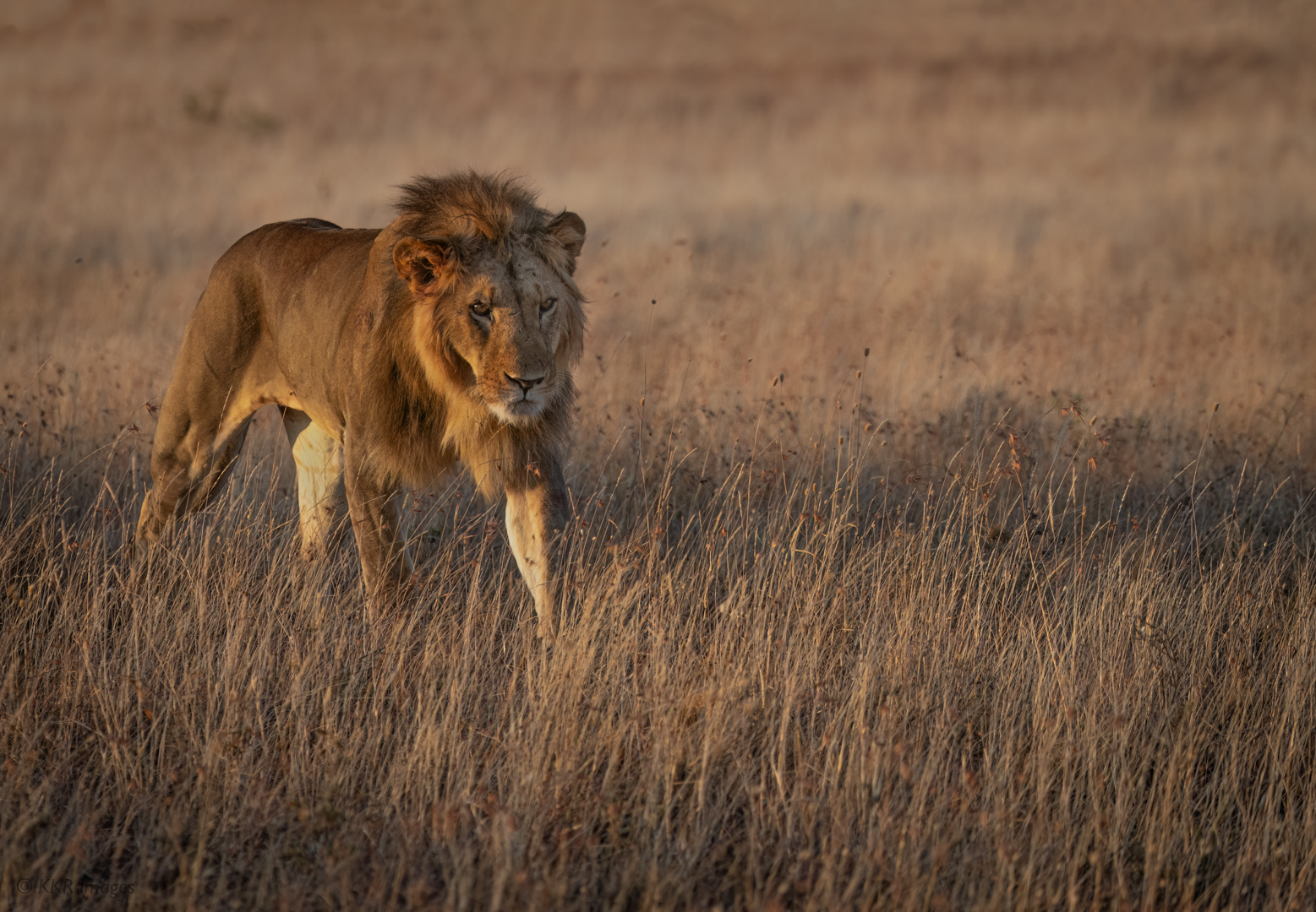
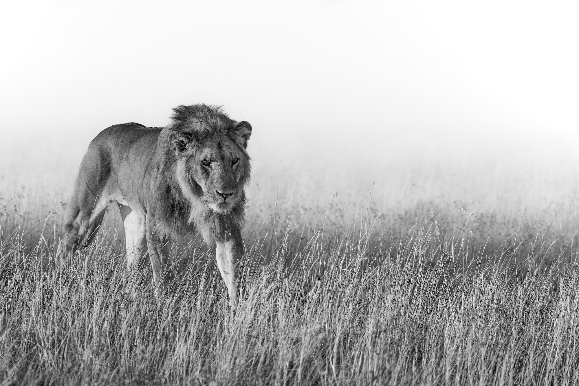
Lion on the prowl (color).jpg
You can only see EXIF info for this image if you are logged in.
Lion on the prowl at dawn (B&W).jpg
You can only see EXIF info for this image if you are logged in.
 
I prefer colour here as it puts the lion in context as it were. The b&w loses the back drop, which I don’t care for.
Thanks for weighing in Patrick. The early morning light was really beautiful and brought out the colors of both the lion and the grass. But, I tried the B&W to emphasize the lion who is so fully focused while on the prowl. Kathy
 
It might be good as a straight monochrome because the tones in the coat could be drawn out. The high key, which I'd call more high contrast than high key, does not work for me personally.
 
I much prefer the color version, since it better captures the lion in the context of its habitat. In the monochrome version, the lion and the foreground merge to some extent.
 
It might be good as a straight monochrome because the tones in the coat could be drawn out. The high key, which I'd call more high contrast than high key, does not work for me personally.
Thank you for the comments on the monochrome treatment, Bill. I did try a more traditional monochrome but wanted to play with a bit different look to increase the drama. Good to know that this does not work for everyone. Kathy
 
Color for me. The black and white is interesting, but the color gives me a better connection to the animal and his environment, if that makes sense.
 
I really think it depends on what story you're telling with the image. The color gives me a sense of time and place. There is enough of the grassland environment to give me (the viewer) a sense of where this beautiful creature lives..

The black and white is more dramatic and makes him look more menacing. I think what barking beans said above, he looks like he is stepping out with purpose.

If I were forced to pick, I would pick the color. Mainly because I've never seen a lion in the wild and the photo makes me feel like I just saw one out there in the bush.

Jeff
 
I really think it depends on what story you're telling with the image.
Story?

If I had been the photographer, the story would be something like this:
  • That lion's far too close (rather, I'm too close)!
  • It's ok: the lion's going to walk right past.
  • Oh, no: it's looking straight at me!
Yes, this outstanding photo conveys a 'story' and the vegetation provides the 'environment'.

Prefer the B&W or prefer the colour: either way, the image is essentially monochrome and, because of this, my vote is for the colour which proclaims 'Camouflage!'… and the lion's bearing proclaims 'I don't need camouflage; not now!'

Such insouciance: power and confidence without a hint of swagger! For me, that's the story; and it's conveyed wonderfully in your image, Kathy.

… David
 
Last edited:
I prefer the B&W...... The color looks like many other lion images. The B&W takes the image to another level....predator on the hunt.....no pretty colorful kitty cat.....Just it and you....the prey. At least that is my humble opinion.
 
I notice in the color the eyes look better. But I prefer the B-W image, and I'd edit the B-W to include the color eyes (may - may not work but worth a go).
 
Monochrome works well with images that have a strong graphic aspect to the subject. This is evident with David Yarrow's B&W images of elephants. With your shot of the lion the B&W eliminates the background and the subject's environment and might as well have been taken at a zoo.
 
I actually like the B&W more. The color is just a lion in the grass whereas the B&W looks like he's emerging with a purpose.

For both of them - I suggest you mask the eyes and increase the midtones to make them pop, especially if you go with B&W.
Thank you for the suggestion on the masking. I have made some adjustments already for the images I posted but will experiment with a few more.
 
Back
Top