fotogrob
Well-known member
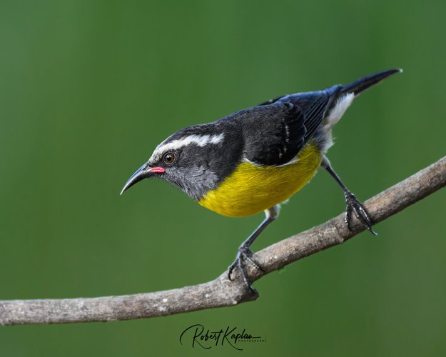
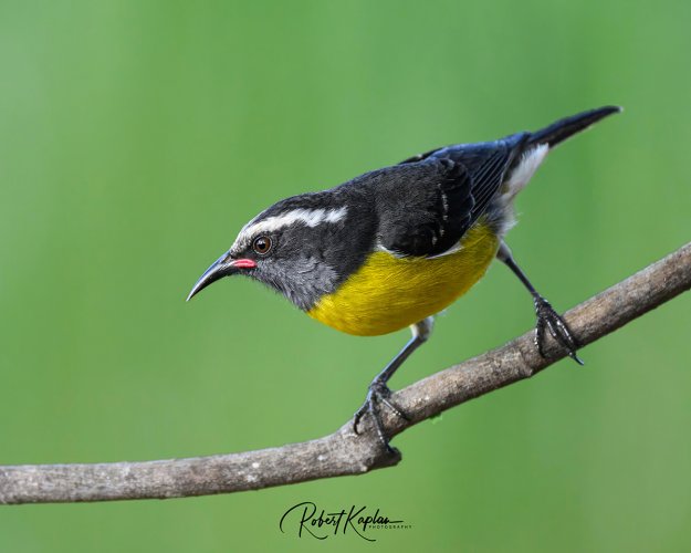
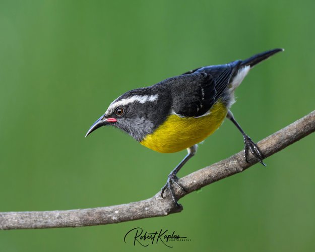
After joining a local camera club which holds competitions, I've discovered that darker backgrounds do well to make the subject "pop". I can see that. But on the other hand, photographers like Jan Wegener seem to prefer lighter pastel like backgrounds which look good too. So in that vein, here a 3 photos I took a a recent vacation in Antigua. One BG is unedited, one 1/2 stop darker, one 1/2 stop lighter. I sense the answer might be personal taste or ultimate use of the image.
Which do you prefer and why? Much appreciated.
Which do you prefer and why? Much appreciated.
")