5 Pro Secrets For Better Wildlife Backgrounds

If you would like to post, you'll need to register. Note that if you have a BCG store account, you'll need a new, separate account here (we keep the two sites separate for security purposes).

Steve

Admin
Staff member
Supporting Member
Marketplace
If you want to take your wildlife photos to the next level, you gotta start with the background. In this video, I'll show you how to get great backgrounds with any lens (SURPRISE - you don't need a big, fast prime to do it). I'll show you how to strategically leverage your position, distance, and current gear to create backgrounds that'll skyrocket the impact of your photos instantly.

Check out the video below - in less than 8 minutes, you'll be knocking out backgrounds like the pros :)

(Also, this was inspired by a recent conversation here at the forum). :)

 
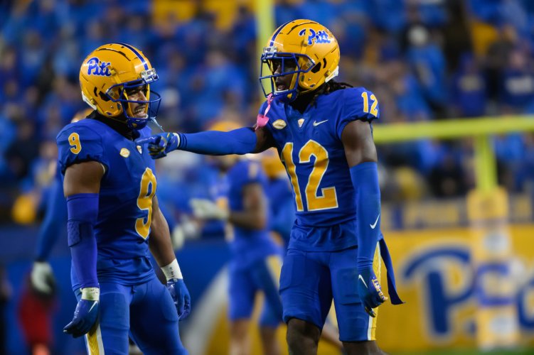
These tips also work for sports photographers. For shooting football, I get the best backgrounds when a player is near the goal line and the nearest fans are 100 yards away behind the opposing goal line. Not a wildlife photographer, but I do take photos of Panthers! :)
 

Attachments

  • _HB97338.JPG
    _HB97338.JPG
    448.8 KB · Views: 58
#4 is my primary background tool, and it allows me to ignore tip #1 so I can stop down for more DOF.

#5 is certainly controversial. Instead of blurring I'll sometimes make a subtle contrast reduction in the background.

Background color is also a factor; a bright warm-colored background (think autumn leaves) can draw attention away from the subject unless the subject is much more prominent in the image for example even brighter colors than the background.
 
Last edited:
Great advice, as usual @Steve. I would just add one thing....which is extremely easy to do and makes all the difference in the world. GET LOWER!! I see so many photos of people shooting down on subjects that could have been vastly improved if they had just lowered their camera/perspective a little. This is basically the same principle as distancing your subject from the background, as a lower perspective will effectively "push" the perceived background farther away from the subject. (Obviously this does not always apply to BIF or subjects that are higher than your position)

Just my 2 cents...
 
R
Great advice, as usual @Steve. I would just add one thing....which is extremely easy to do and makes all the difference in the world. GET LOWER!! I see so many photos of people shooting down on subjects that could have been vastly improved if they had just lowered their camera/perspective a little. This is basically the same principle as distancing your subject from the background, as a lower perspective will effectively "push" the perceived background farther away from the subject.

Just my 2 cents...
That's covered in a different video :)
 
Great advice, as usual @Steve. I would just add one thing....which is extremely easy to do and makes all the difference in the world. GET LOWER!! I see so many photos of people shooting down on subjects that could have been vastly improved if they had just lowered their camera/perspective a little. This is basically the same principle as distancing your subject from the background, as a lower perspective will effectively "push" the perceived background farther away from the subject. (Obviously this does not always apply to BIF or subjects that are higher than your position)

Just my 2 cents...
Yup :) I agree 100000%

 
In response to the video, I think 5 isn't something I want to do personally. Not that I'm against it for others, just not something I'll probably ever do.

Good video as always though.
 
Great advice, as usual @Steve. I would just add one thing....which is extremely easy to do and makes all the difference in the world. GET LOWER!! I see so many photos of people shooting down on subjects that could have been vastly improved if they had just lowered their camera/perspective a little. This is basically the same principle as distancing your subject from the background, as a lower perspective will effectively "push" the perceived background farther away from the subject. (Obviously this does not always apply to BIF or subjects that are higher than your position)

Just my 2 cents...
I wear kneepads and kneel while shooting football as to many other football photographers. Yes, my legs are sore the day after a game. Makes a huge difference in the backgrounds and exaggerates how much air is under players when they leap. Unfortunately it makes it harder to get out of the way when they come flying in your direction.
 
I have never used #5 before (soften the background in post) but am starting to dabble with this a bit. I have tested out Adobe's new Blur AI and found it doesn't look that great for a lot of shots, I like your idea of using masks with linear gradients and removing the subject and then lightly dropping contrast. Question for you @Steve and others, when doing this are you only touching the contrast slider or do you also use a hint of clarity (drop -). And great tip on adding in a little grain after doing all of this to match with the scene.
 
As far as your question about how much detail we like to see in our backgrounds, I will say that I know some photographers who always seem to have backgrounds that look like a studio background . Between background blur, cloning, and dodging and burning it can really "sanitize" a picture to my eye. As you said, a natural background that doesn't compete with the subject is my goal. Good video, Steve.
 
Good stuff Steve.

All great tips, but using longer glass when possible and repositioning for background (including getting low as posted above) are the big ones for me.

In terms of your questions in the video, there are a lot of background styles that work but I do like the subject to pop. As you demonstrate with sufficient contrast, often color contrast, between your subject and background you can get plenty of pop with crisp backgrounds. I also agree it doesn't have to be all or nothing when it comes to selective focus, sometimes a pure creamy color blur is nice but often if the shot can include some background texture or hints, even strong hints, of the environment the resulting image can be stronger or at least tell more of a story. So it's not one or the other to me, I like soft backgrounds but they don't have to be totally blurred out and sometimes the subject vs background: lighting, contrast or color variations can work even when the background is within the DoF and sharp.

I'm not a big fan of background blurs in post but I do think it's a good tool to have in your toolbox especially for folks shooting some of the slower lighter lenses out there. As you said, it tends to work best with a gentle touch and when it's pretty subtle. Heavy handed background blurs in post aren't something I like but I guess that applies to just about any heavy handed editing that is easy to spot in the final image.
 
I think in general just looking with our eyes things farther away will have less value/luminosity contrast in the sense that the darker objects appear lighter to grow lighter with distance while lighter objects seem to stay more steady. There is also less saturation to our eyes when something is farther away. Also things seem to cool as they get farther away. So good nudges in post if one wants something to seem farther away might be lightening up darks, cooling it down by nudging it a bit toward the blue, and pulling back saturation.
 
I have never used #5 before (soften the background in post) but am starting to dabble with this a bit. I have tested out Adobe's new Blur AI and found it doesn't look that great for a lot of shots, I like your idea of using masks with linear gradients and removing the subject and then lightly dropping contrast. Question for you @Steve and others, when doing this are you only touching the contrast slider or do you also use a hint of clarity (drop -). And great tip on adding in a little grain after doing all of this to match with the scene.
It all depends on the image, no two are alike and each takes a different approach. Sometimes I'll drop clarity and texture a bit - but too much makes it really look fake - sometimes even putting halos around the edges of the mask.
 
In terms of your questions in the video, there are a lot of background styles that work but I do like the subject to pop. As you demonstrate with sufficient contrast, often color contrast, between your subject and background you can get plenty of pop with crisp backgrounds. I also agree it doesn't have to be all or nothing when it comes to selective focus, sometimes a pure creamy color blur is nice but often if the shot can include some background texture or hints, even strong hints, of the environment the resulting image can be stronger or at least tell more of a story. So it's not one or the other to me, I like soft backgrounds but they don't have to be totally blurred out and sometimes the subject vs background: lighting, contrast or color variations can work even when the background is within the DoF and sharp.

Yup, and I think that's where people get stick sometimes - they want to always kill the background or they always want it too sharp. I think it depends one the subject and what you're trying to convey. :)
 
I think in general just looking with our eyes things farther away will have less value/luminosity contrast in the sense that the darker objects appear lighter to grow lighter with distance while lighter objects seem to stay more steady. There is also less saturation to our eyes when something is farther away. Also things seem to cool as they get farther away. So good nudges in post if one wants something to seem farther away might be lightening up darks, cooling it down by nudging it a bit toward the blue, and pulling back saturation.
I agree - and I often use those exact tricks in my own images during post :)
 
Yup, and I think that's where people get stick sometimes - they want to always kill the background or they always want it too sharp. I think it depends one the subject and what you're trying to convey. :)
Watching your video and reading this thread led me to wonder what I actually do vs what I think I do regarding backgrounds. Rather than jump into LR and navigate through a bunch of collections or folders I just did a scroll down through my Member's gallery here on BCG as a Quick Look at what I've posted here.

I didn't do a real tally or any math but on first glance it seems about 10% of the wildlife images I posted have a completely smooth out of focus background with no texture or environment hints, maybe half of that percentage for images with crisp and in focus backgrounds and the rest used some form of selective focus that still showed texture or visible but blurred environmental features as backgrounds.

So I guess at least in terms of what I posted on these boards that's around:
85% selective focus with some texture or a lot of identifiable but out of focus background detail
10% completely out of focus and smooth backgrounds
5 % in focus and sharp backgrounds.

Not real percentages of course but somewhere in that ballpark.
 
Thanks Steve, another informative video. Regarding background blur..what's the big deal? If you're a purist then you should also object to most adjustments done with images, even a simple curves adjustment to add contrast that wasn't present in the scene but adds interest to your subject. Is sharpening your subject OK but de-sharpening or bluring the background not OK? WHat's the difference?
 
Watching your video and reading this thread led me to wonder what I actually do vs what I think I do regarding backgrounds. Rather than jump into LR and navigate through a bunch of collections or folders I just did a scroll down through my Member's gallery here on BCG as a Quick Look at what I've posted here.

I didn't do a real tally or any math but on first glance it seems about 10% of the wildlife images I posted have a completely smooth out of focus background with no texture or environment hints, maybe half of that percentage for images with crisp and in focus backgrounds and the rest used some form of selective focus that still showed texture or visible but blurred environmental features as backgrounds.

So I guess at least in terms of what I posted on these boards that's around:
85% selective focus with some texture or a lot of identifiable but out of focus background detail
10% completely out of focus and smooth backgrounds
5 % in focus and sharp backgrounds.

Not real percentages of course but somewhere in that ballpark.
I feel like those are very close to my own numbers looking at Lightroom. Most of the time I tend to favor "suggestive" backgrounds that give a notion of the habitat with just enough detail for the viewer to make good assumptions :)
 
Thanks Steve, another informative video. Regarding background blur..what's the big deal? If you're a purist then you should also object to most adjustments done with images, even a simple curves adjustment to add contrast that wasn't present in the scene but adds interest to your subject. Is sharpening your subject OK but de-sharpening or bluring the background not OK? WHat's the difference?
I tend to agree. As long as it looks realistic, I'm fine with it :)

Where I tend to not like artificially, blurred backgrounds is when they look out of place, and you can tell it was deliberately blurred. I think the photo should feel like a photo in represent the feelings and impressions you had at the time you press the shutter.

Sometimes an awful lot of behind the scenes post processing is needed to get a shot to look natural.
 
Thank you for the background tips video. Some are obvious and all are mentioned on public sources, but your approach makes it very understandable.
And it is not a wasted effort. There is so many pictures on the net which look terrible just because their handling of background. Sometimes even to the point where the subject is lost in a busy surroundings, despite being perfectly sharp.

It is OK to handle background sharpness in post processing. My rationale is that there is no fixed set of rules defining a proper PP. If changing contrast is OK, why should be blurring prohibited? Big NO for me is an outright distortion of the reality of used optics. PP should enhance, not replace IMO.
 
Sometimes an awful lot of behind the scenes post processing is needed to get a shot to look natural.
My problem is that, anymore, I have so many images to process (like, thousands just from the last few years) that if I can't do it relatively fast, I'm out :)

(Unless of course it's something amazing that's worth taking the time - but those are few and far between).
 
Back
Top