Kuki
New member
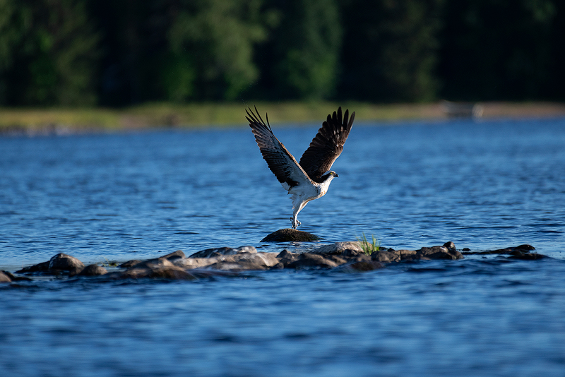
Last summer I managed to snap this photo whilst on a boat, using a d7500 paired with a 200-500mm f5.6 (@ 500mm, 1/2000 sec and iso 560). The horizon is a bit off on the unedited image as the conditions weren't ideal for nailing the framing. This was mainly due to trying to keep the boat from turning with the wind. I accomplished this feat by steering the boat with the tiller under one arm whilst trying to photograph the osprey. I have to thank the amazing VR on the 200-500 as it's most likely what kept this image usable in the first place.
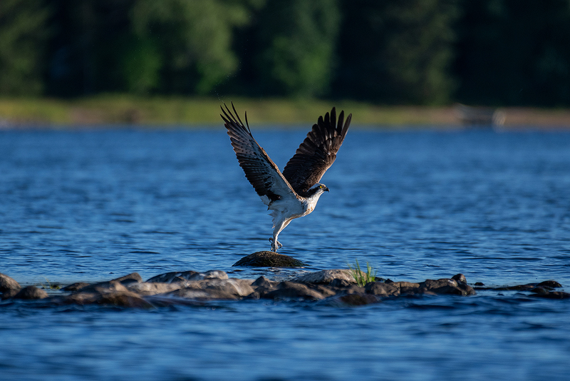
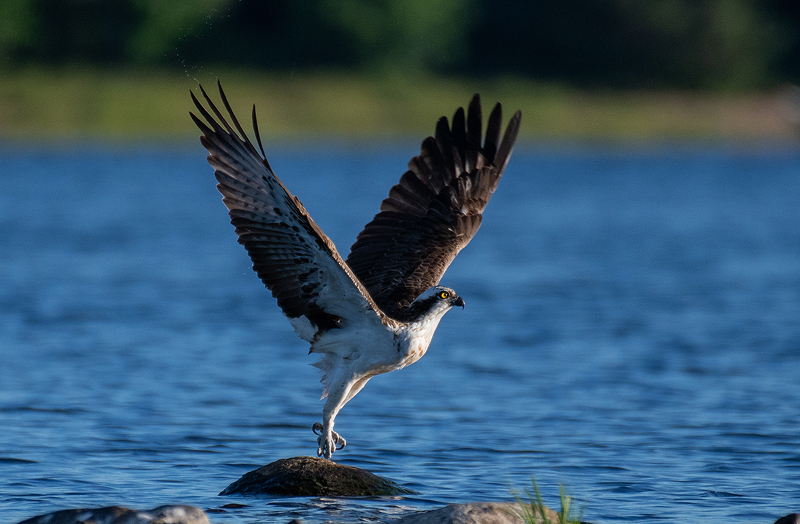
The first image is the original raw file converted into a jpg for reference. The bottom two images are cropped, edited versions, where I have done minor highlight recovery with a mask on the osprey and also played around with the tone curves. The bottom image is merely a crop of the processed photo, so that you guys can appreciate the bird in a higher resolution. As a small side note, all images have had sharpening applied in the process of changing the image size to the 800 pixel web standard for the forum.
So I guess this is the part where I get to the point of this forum. I would like to hear what you guys think of this shot in general. I'm open to all criticism and I would be happy to hear any ideas on improving the image such as alternative crops.
You can only see EXIF info for this image if you are logged in.
You can only see EXIF info for this image if you are logged in.
You can only see EXIF info for this image if you are logged in.
Last edited:

